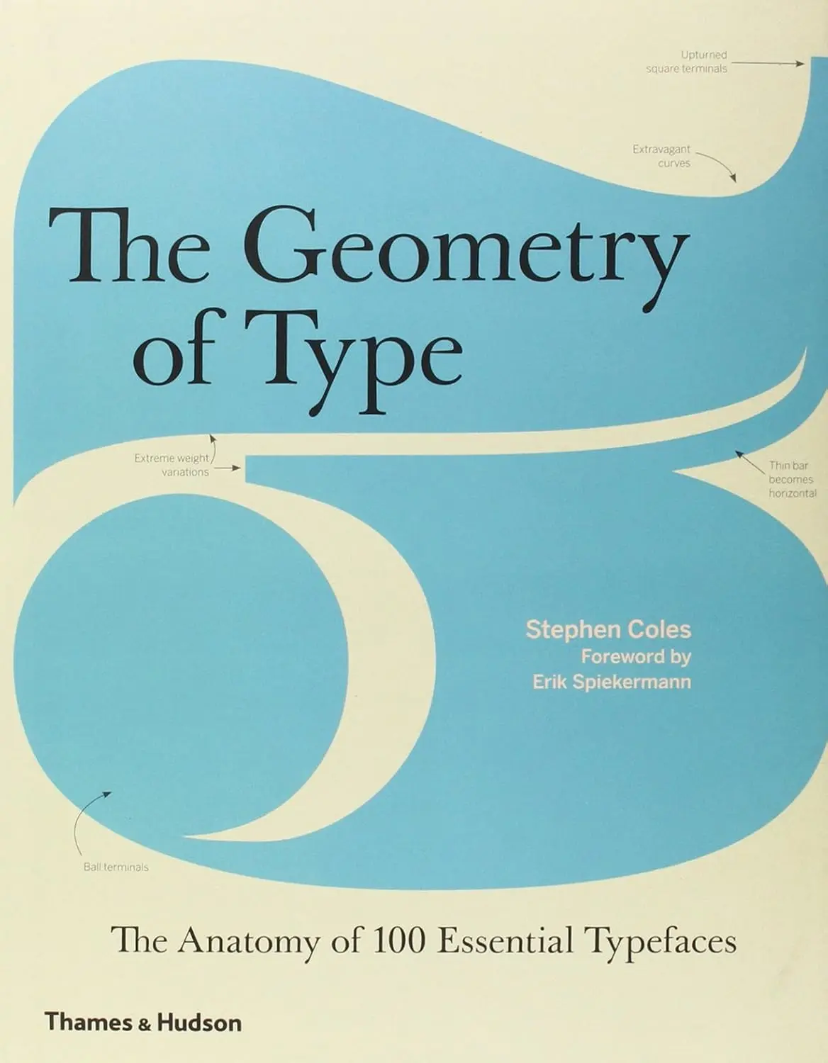
Stephen Coles takes one hundred typefaces and pulls each one apart — the curve of the bowl, the angle of the stress, the behavior of the lowercase g. After a hundred of these, you begin to notice things you cannot un-notice.
You have been looking at letters your entire life. You have never seen them. That gap — between looking and seeing — is exactly what Stephen Coles’s book is designed to close. The Geometry of Type takes one hundred typefaces and pulls each one apart: the curve of the bowl, the angle of the stress, the shape of the terminal, the behavior of the lowercase g. One full spread per typeface. Annotations pointing at the parts that matter. A paragraph on where it came from and what it is for. After a hundred of these, you begin to notice things you cannot un-notice.
The book exists in two editions under two different titles: The Geometry of Type in the UK (Thames & Hudson, 2013) and The Anatomy of Typein the US (Harper Design). The content is identical. The dual title is itself a minor typographic joke — the same thing, wearing different clothes, for different audiences.
Book Details
Full Title
The Geometry of Type: The Anatomy of 100 Essential Typefaces
US Title
The Anatomy of Type: A Graphic Guide to 100 Typefaces
ISBN
9780500292457
On Abakcus
What type anatomy actually means
Typography has a precise anatomical vocabulary, and most people who use type professionally have never learned it. A bowl is the curved stroke that forms the round body of letters like b, d, o, p, and q. A counter is the enclosed white space inside a letter — the hole in the o, the eye of the e. An aperture is the opening where a counter does not fully close, as in c or the top of a. The ascender is the vertical stroke that rises above the x-height in letters like h and d; the descender drops below the baseline in g, p, and y.
Visual — Anatomy of a Letterform
The invisible lines that govern every typeface: baseline, x-height, cap height, ascender line, descender line. Coles annotates each of the 100 typefaces against exactly these reference points.
These are not decorative terms. The x-height — the distance from baseline to the top of a lowercase letter like x — determines how a typeface reads at small sizes. A high x-height makes text more legible in body copy; a low x-height gives a typeface elegance at display sizes but sacrifices readability in long passages. The aperture controls how open or closed a typeface feels: wide apertures read clearly; tight apertures feel dense and formal. The design decisions behind every letter in every typeface are decisions about these parameters — and Coles makes each one visible.
The book’s structure: one spread, one typeface
The format is strict and efficient. Each typeface gets a full double-page spread. On the left page: a single word, or a short phrase, set in the typeface at enormous size — large enough that the features Coles wants to annotate are clearly visible. Leaders — the thin lines pointing from annotation to letter — identify the specific letterforms under discussion: the double-storey g, the tail of the R, the aperture on the a. On the right page: a complete character set at a smaller size, sidebar data on the designer, foundry, year of release, and available weights, and a short essay on origin and use cases. The tradition of laying out letterforms at scale for inspection has deep roots; as Victorian turning specimens showed two centuries earlier, the act of displaying a form for comparison is itself a form of analysis.
The one hundred typefaces are organized into sixteen categories. This is where the book is most useful as a reference — and most instructive as education:
The classification itself teaches something. Helvetica and Univers sit in the same category — Neo-Grotesque Sans — not because they look identical but because they share the same design ideology: neutrality, absence of personality, maximum readability without expression. Futura is in a different category entirely — Geometric Sans — because its letters are constructed from precise geometric primitives: the circle, the rectangle, the straight line. The same geometric reduction that drove the Bauhaus curriculum and that Lupton & Miller traced to Kandinsky’s questionnaire gave Futura its formal vocabulary. The o in Futura is a nearly perfect circle. The o in Helvetica is not. That single difference in construction philosophy separates the entire feel of the two typefaces.
If you know the difference between a font and a typeface, you need this book; if you don’t, you need it even more.
— Erik Spiekermann, foreword to The Anatomy of Type
Stephen Coles: the typographer as connector
Coles’s background is unusual. He spent six years as creative director at FontShop in San Francisco, then co-founded two online resources that became essential infrastructure for anyone who cares about type: Fonts In Use, a public archive documenting typefaces in real-world contexts, and Typographica, a review publication covering typeface releases. He currently serves as Associate Curator and Editorial Director at Letterform Archive, a nonprofit special collections library and museum in San Francisco. His interest, as he describes it, is the relationship between font makers and font users — the gap between the designer who creates a typeface and the person who picks it for a project without quite knowing why.
That interest shapes the book. Each entry does not just describe a typeface — it tells you who made it, when, for what original purpose, and what it is actually good for today. Garamond was cut in the sixteenth century; it is still a standard choice for book text because its proportions were optimized for long reading. Futura was designed in 1927 by Paul Renner as a geometric ideal; it is everywhere in modernist branding because its precision reads as rational, forward-looking, uncluttered. At the Bauhaus workshops of the same era, designers were working through the same reduction — stripping forms to their geometric core, asking what remained when the decorative was removed. Knowing this does not change what the letters look like, but it changes what you reach for when you need to make a choice.
Takes an appreciation of letterforms to another level.
— Creative Review
The selection: half familiar, half not
Coles has described the selection strategy: roughly half the one hundred typefaces are common names that any designer would recognize — Garamond, Helvetica, Baskerville, Futura, Times New Roman — and half are fresher, less widely known typefaces that are equally useful, or more so. The familiar ones provide easy points of comparison; the unfamiliar ones expand the vocabulary. This is a pedagogical choice as much as an editorial one. You learn what makes Baskerville distinctive partly by reading about Baskerville and partly by reading about the typefaces around it. Contrast sharpens perception.
The book does not pretend to be exhaustive. One hundred typefaces from a history that contains tens of thousands is a selection, not a survey. Coles is not trying to document the field — he is trying to teach a way of looking. The specific one hundred matters less than the habit of attention they install.
Who should read this book
The obvious audience is designers. For a graphic designer who learned Illustrator before learning type history, this book fills a gap that most design school curricula leave open. But the book is not technical in a way that excludes anyone else. There are no prerequisite skills required. What it requires is patience — the willingness to stop, look at a letter, look at it again, and let the annotation guide your eye to something you missed.
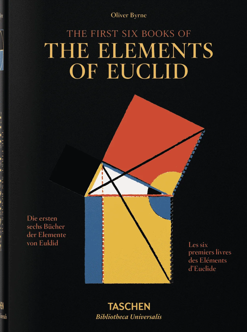
For a mathematician, or for anyone whose relationship to visual form runs through geometry, the book offers an unexpected angle. The Geometry of Type is, in one reading, a catalog of design constraints. Every typeface is a solution to a set of competing requirements: legibility at small sizes, elegance at large sizes, consistency across an alphabet of wildly different shapes, compatibility with the typefaces it will appear alongside. The same impulse — to make a diagram’s logic visible through annotation — drives Oliver Byrne’s color Euclid, which replaces proof notation with colored geometric marks. The vocabulary of type anatomy is the vocabulary of that optimization made visible.
Sources
- 1.Interaction Design Foundation. “What Is Type Anatomy?” interaction-design.org ↗. Anatomical term definitions.
- 2.Coles, S. The Geometry of Type: The Anatomy of 100 Essential Typefaces. Thames & Hudson, 2013. ISBN: 9780500292457.
- 3.Letterform Archive. Stephen Coles biography. Amazon author page: amazon.com ↗.
- 4.Herrmann, R. “‘The Geometry of Type’ — 100 typefaces explained by typographer Stephen Coles.” opentype.info, March 7, 2013. opentype.info ↗.
- 5.Spiekermann, E. Foreword to The Anatomy of Type. Harper Design, 2013. ISBN: 9780062203120.
Stephen Coles — The Geometry of Type
Thames & Hudson, 2013 · abakcus.com