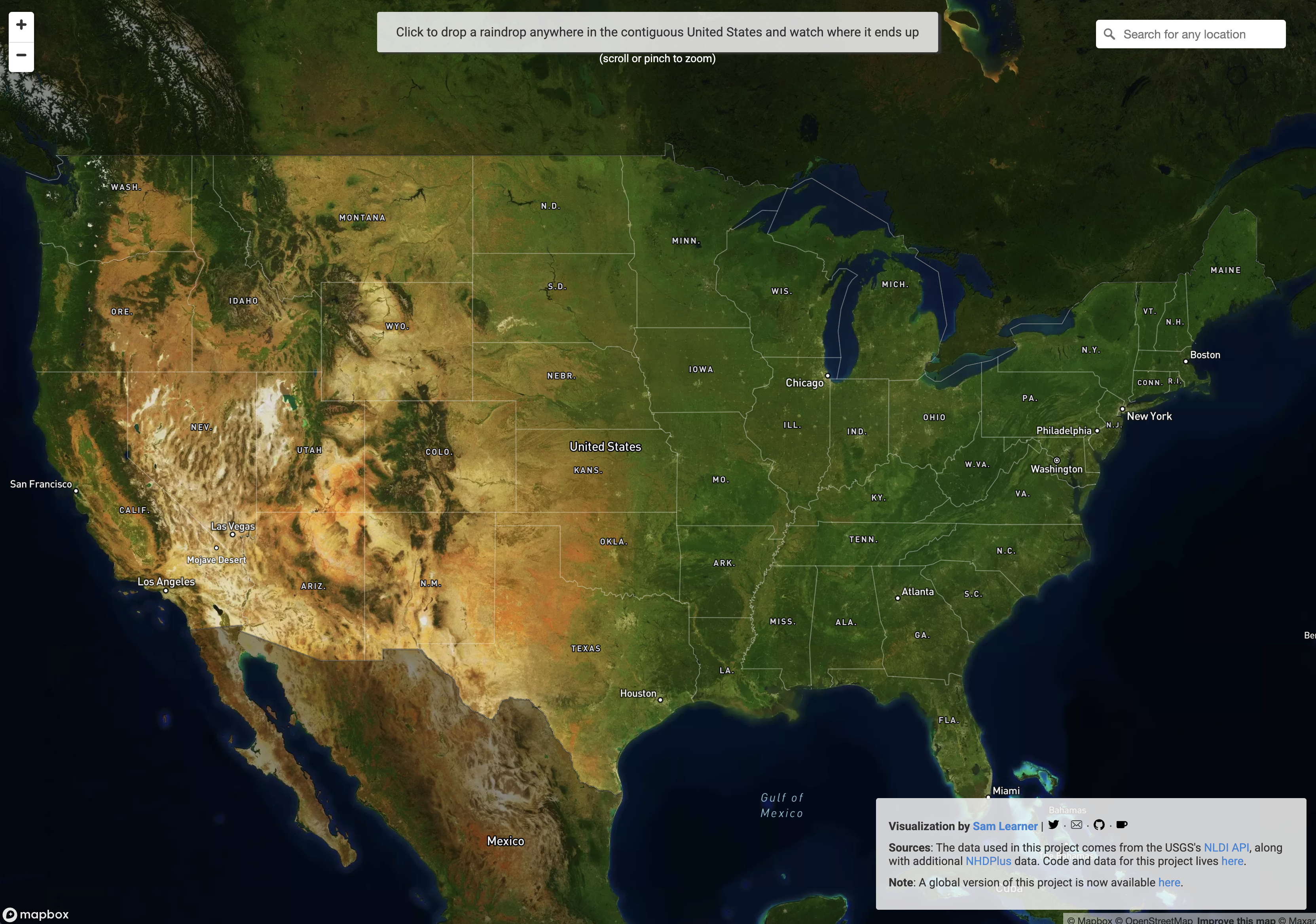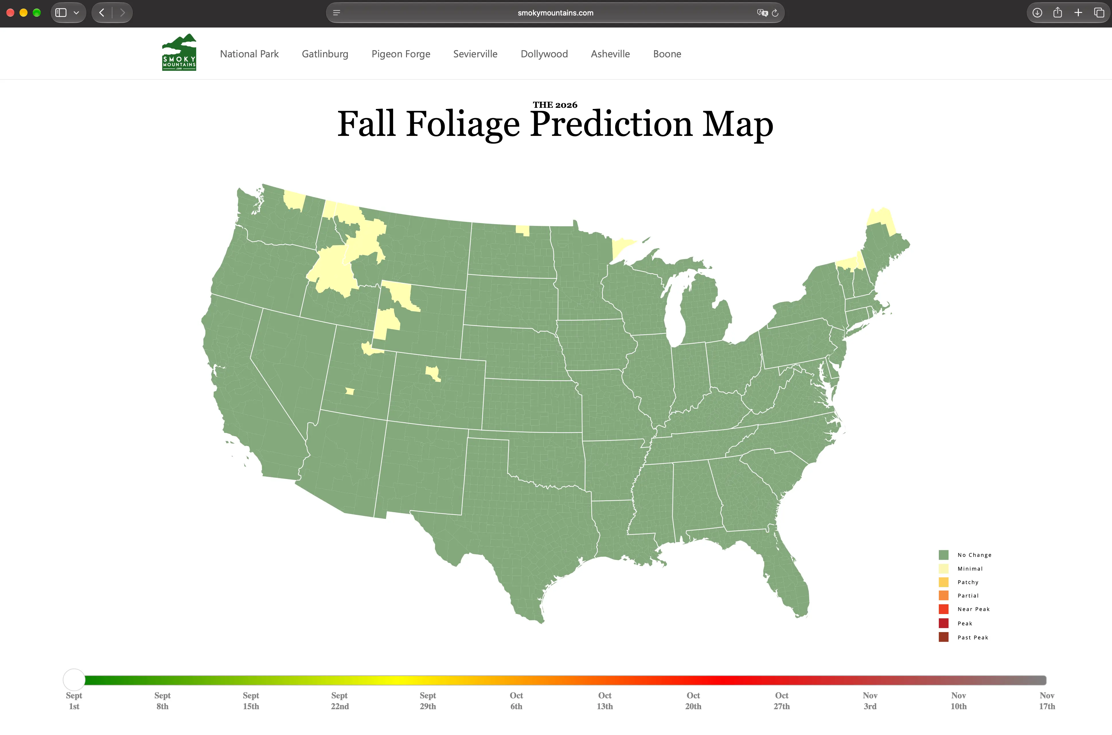
Every year toward the end of August a map lands on the internet and within a few weeks everyone is sharing it. The map colours the US county by county, and as you drag the slider at the bottom from week to week you can watch autumn come down from the north and from the tops of the mountains. There are seven stages, from no change to past peak, and each county takes the colour of whatever stage it will be in that week. The 2026 edition has been up since mid-August and it sits there with its slider, ready to be played with. It belongs with River Runner on the short list of maps that teach you more geography with one gesture than an atlas does with a hundred pages.
The people who make the map are not meteorologists or foresters. SmokyMountains.com is a site that rents cabins around the Great Smoky Mountains, and the map starts in 2013 as a fun side project by David Angotti and Wes Melton but quickly turns into the first place people check for fall colour. As Angotti tells it, guests kept asking when the colours would turn in the Smokies, so to avoid giving bad advice they started working with a meteorologist, and because the first year’s forecast held up, people asked for a new one the next year.
Among Angotti’s favourite users are a bride who moved her outdoor wedding to peak week and a director who scheduled a film shoot around the map. I like that something a cabin rental site made to pull in customers turned out this useful and this much fun, because most things made as advertising manage neither.
This map is not real. I coloured a made-up country with one mountain range in the west and one in the east, using nothing but latitude and elevation, according to the Hopkins rule I explain below.
What goes into the map
The model works through NOAA’s historical and forecast temperature and precipitation data, the peak dates of past years, the results of earlier models, average daylight exposure and elevation all together, and the total comes to several million data points. According to Melton, why leaves change colour is well understood, but working out the day they will change is much harder because it means accounting for temperature, sunlight, precipitation and soil moisture at the same time. That is why the map is drawn from scratch every year and the prediction sharpens as the peak gets closer.
The map has two views, one shows what colour the country will be on the date you pick while the other shows which week each region reaches peak, and if you type a city or a national park into the search bar the map zooms there and links to a local forecast. For anyone planning a trip the second one is the one that matters, because the question is usually not where autumn is right now but when it will reach the place you want to go.
Why the green goes
The green of a leaf comes from chlorophyll, and all summer the tree keeps making it over and over. When the days shorten production stops, and as the chlorophyll breaks down the yellow and orange pigments that were in the leaf all along, the carotenoids and flavonols, become visible. Red is another story, because anthocyanins are not waiting there all summer, their production jumps in autumn and it helps the leaf stay on the branch a little longer. A yellow leaf was yellow the whole time, a red leaf makes its red itself in the last few weeks. Telling those shades apart by name is exactly the problem Werner’s Nomenclature of Colours was written to solve.
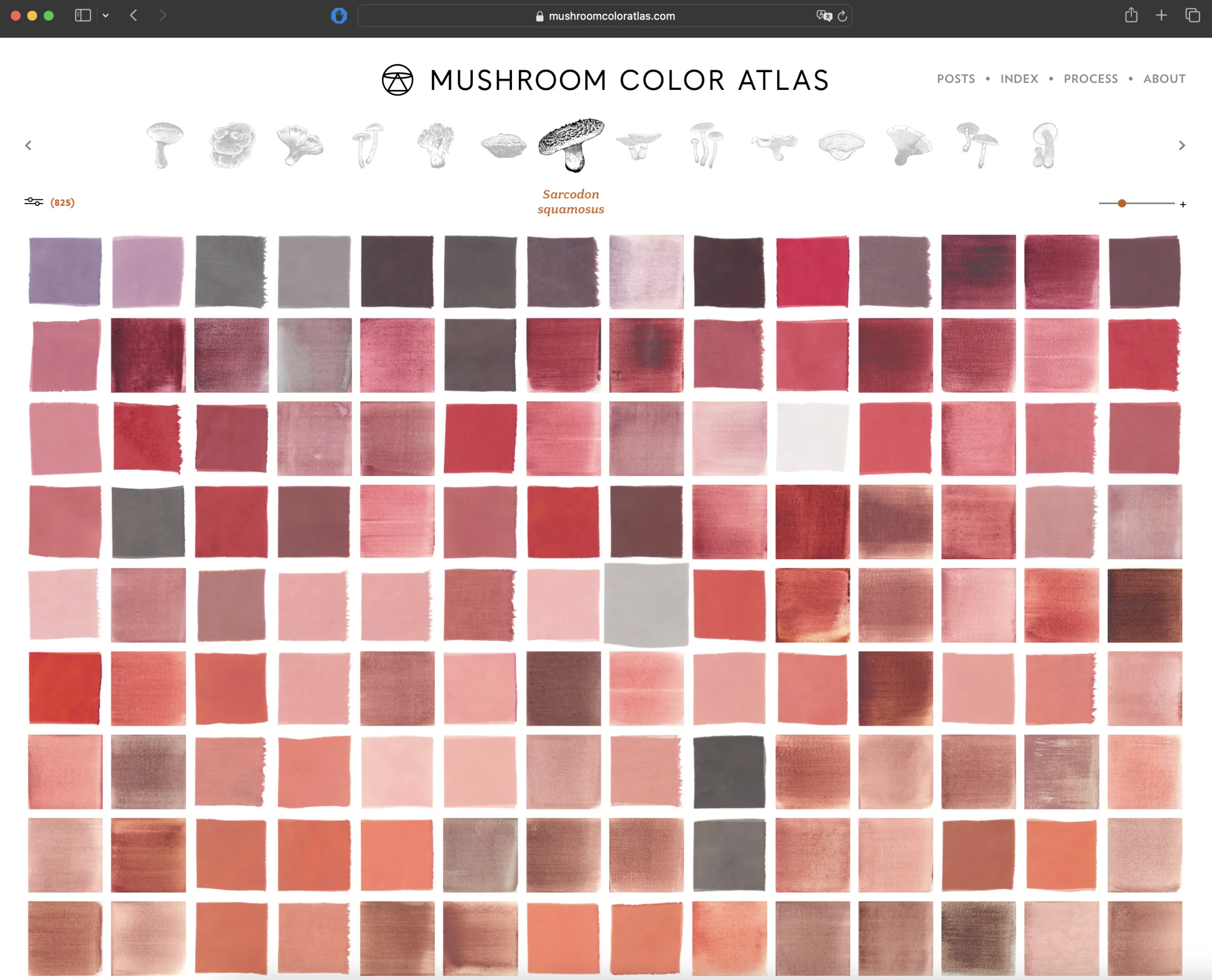
The colours are at their brightest when days sit in the 70s and nights drop into the 40s Fahrenheit. Warm days pile sugar up in the leaf, cold nights slow it from flowing back into the branch, and that sugar is what red is made from. Like the dyes in the Mushroom Color Atlas, the colour belongs to one place and one stretch of weather.
Hopkins’ four days
The pattern on the map, colour moving from north to south and from peak to valley, lines up almost exactly with a rule more than a hundred years old. Andrew Delmar Hopkins, who found it, is an entomologist, and leaves are not what he cares about. Hopkins develops his rule to predict when the autumn flight of the Hessian fly will end, because after that date wheat can be sown without feeding the fly and next year’s harvest is safe too. It is the same kind of question as why fireflies flash in unison: not what nature does, but exactly when.
In his 1918 paper Bioclimatic Laws, Hopkins writes that if you see a spring event on a certain date in one place, you will see it four days later for every degree of latitude to the north, every five degrees of longitude to the east and every 400 feet (122 metres) of elevation, and he adds that autumn events come earlier by the same intervals.
The longitude part is a bit blurry, because some sources give the rule as every five degrees of longitude to the west rather than the east. That is why I left longitude out of the calculator below altogether. Latitude and elevation carry most of the pattern on their own.
Forty-five days in the Smokies
Apply the rule to the mountains where the map was born and something nice comes out. In the Great Smoky Mountains colour starts around mid-September in the beech, pin cherry and yellow birch above 5,500 feet. If we take the valley floor as 1,000 feet, the 4,500 feet between them comes to 45 days by Hopkins’ arithmetic, six and a half weeks. Local guides say the colour show in the park lasts seven weeks or more depending on temperature and day length. A rule built for a wheat fly gets the length of a season on a mountainside right to within a few days.
A tougher test comes from the Alps. In a study built on roughly 20,000 observations at 128 sites in the Alps, leaf-out in the early 1960s was delayed 34 days for every 1,000 metres of elevation, in line with Hopkins, but by 2016 the gap had shrunk to 22 days. Convert Hopkins’ four days per 122 metres to 1,000 metres and you get 32.8 days, so the rule hits a number measured forty years later to within a day. The researchers blame the later drop mostly on warming winters. That study measures spring leaf-out, not autumn, but when you think that both ends hang on the same climate, it is easier to see why the map is rebuilt from scratch every year.
Your own calculation
I set the starting point of the calculator below where I live, around Little Rock. As you change latitude and elevation you can see how many days earlier or later, by Hopkins, the colours should turn compared to there.
This is Hopkins’ rule and nothing else. Rain, frost and tree species don’t enter into it, so read the result as an average, not a forecast.
Where the arithmetic fails
Hopkins himself writes that the rule rests on an average rate of change measured across the country and holds only when all other things are equal. All other things are never equal. This year New England and upstate New York expect a good colour season after a wet spring and summer followed by a drying fall, and the SmokyMountains.com model adds each year’s own temperature and rainfall on top of Hopkins’ fixed four days precisely to catch differences like that.
Still, no model can account for wind. As Angotti puts it, in an autumn that is going beautifully a single storm can strip the leaves away in minutes.