Interactive Tool · Statistics · D3.js
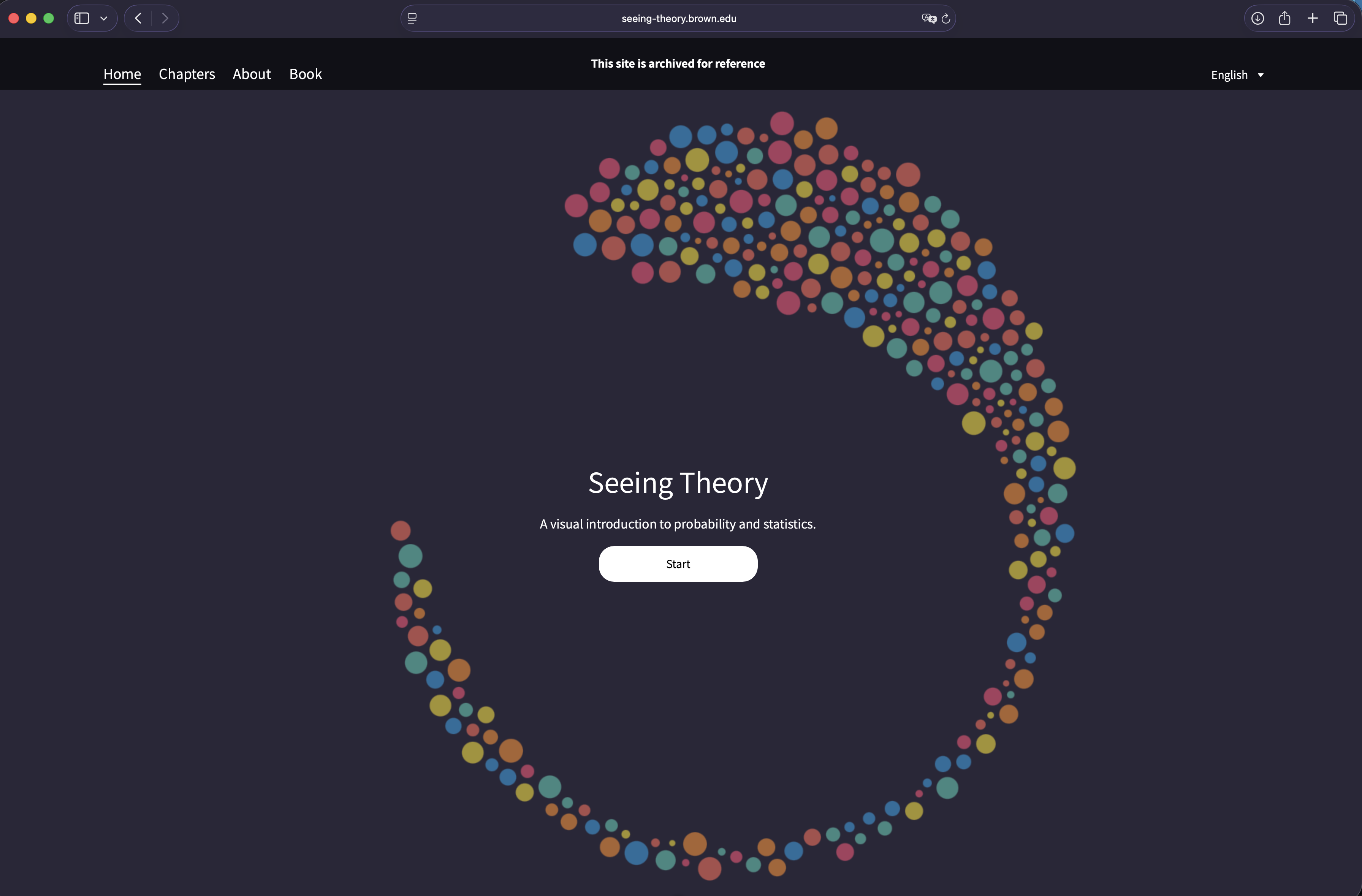
Seeing Theory
A Brown University student decided that statistics was misunderstood because it was invisible. So he made it visible — and changed how a generation encounters probability.
Statistics courses have a reputation problem. The concepts themselves — probability, inference, distributions — are not inherently opaque. They are descriptions of how the world behaves under uncertainty. The problem is that they are almost always taught through formulas alone, which is a bit like teaching swimming by handing someone a physics textbook.
Seeing Theory is a website built on a different premise: that the real barrier to understanding statistics is not mathematical difficulty but the absence of a mental image. If you can watch a probability distribution form in real time, if you can drag a parameter and see the curve respond, if you can build intuition through direct manipulation — the formulas that follow stop being obstacles and start being shorthand for things you already understand.
The project was created by Daniel Kunin while he was an undergraduate at Brown University. He built the interactive visualizations using D3.js, the data visualization library written by Mike Bostock — a tool designed precisely for binding visual representations to data and making them respond to user interaction. The result, released in 2017, won a Webby Award, was covered by Fast Company, Communication Arts, and SXSW, and was recognized by Brown University itself as an exemplary piece of educational work.
“The goal of this website is to make statistics more accessible through interactive visualizations.”— Daniel Kunin, Seeing Theory
Six Chapters, One Argument
The site is organized into six chapters that trace a natural path through the field — from the first principles of probability to the applied machinery of regression analysis. Each chapter contains three subsections, and each subsection is a standalone interactive experience: you set parameters, you watch the mathematics move, and the concept arrives through the motion rather than through the explanation.
Basic Probability
Chance Events · Expectation · Variance
Compound Probability
Set Theory · Counting · Conditional Probability
Probability Distributions
Random Variables · Discrete & Continuous · Central Limit Theorem
Frequentist Inference
Point Estimation · Interval Estimation · The Bootstrap
Bayesian Inference
Bayes' Theorem · Likelihood · Prior to Posterior
Regression Analysis
Ordinary Least Squares · Correlation · Analysis of Variance
The progression is deliberate. It begins with the most elemental — what does it mean for an event to have a probability? — and builds through compound events, distributions, and inferential methods before arriving at regression. By the time you encounter Bayes' theorem in Chapter 5, you've already built, visually and intuitively, the machinery it depends on.
Why Visualization Changes the Experience
Consider the Central Limit Theorem — one of the most important results in all of statistics, and one of the most counterintuitive. It says that regardless of the shape of a population's distribution, the distribution of sample means drawn from that population will approach a normal distribution as the sample size increases. In a textbook, this is a theorem with a proof. In Seeing Theory, you set the population distribution to whatever shape you want — skewed, bimodal, uniform — and watch the sampling distribution normalize before you as you increase the sample size. The theorem stops being a claim about the world and becomes something you've seen happen.
The same holds for conditional probability, which is notoriously slippery when encountered abstractly. The visualization makes it spatial: you see which part of the probability space is being conditioned on, and how that changes the relative sizes of the remaining outcomes. The mistake that produces the famous Monty Hall confusion — failing to update probabilities when new information arrives — becomes much harder to make when you can watch the update happen geometrically. The principle is the same one that governs Sudoku's graph structure: a constraint that is invisible in the abstract becomes obvious the moment you draw it.
The site is built with D3.js, the JavaScript library for producing interactive, data-driven visualizations in the browser. D3 binds visual elements directly to data and allows them to respond smoothly to changes in parameters — which is precisely what makes Seeing Theory's manipulable diagrams feel live rather than static.
The Team
Kunin was joined by three collaborators who helped bring the project to its final form.
Daniel Kunin
Creator & Design
Jingru Guo
Visualization
Tyler Dae Devlin
Development
Daniel Xiang
Mathematics
Recognition
The project was received seriously from the moment of its release. It won the Information is Beautiful Awards, was selected by Communication Arts, and took a Webby Award in the Education category in 2018. It was recognized at SXSW. Fast Company covered it as a visual guide to statistics. The Cape and Islands public radio station ran a segment describing it as a website that would make you fall in love with the subject.
Beyond the awards, the site became part of how people actually teach and learn introductory statistics. It has been used in classrooms, recommended in syllabi, and shared across online communities wherever people try to make mathematical ideas legible to the people who need them most. A companion textbook was developed alongside the site — a draft is available for download — which gives the same material a more traditional written treatment for those who want the visual and the rigorous together. For a parallel approach applied to geometry, Oliver Byrne's 1847 Euclid replaced every proof with a color diagram for exactly the same reason: to make abstract reasoning visible before the symbols arrive.
The site is currently archived at its original URL at Brown University, meaning it remains accessible and fully functional as a reference. Everything built into it — the six chapters, the eighteen subsections, the interactive diagrams — continues to work exactly as Kunin designed it.
The case Seeing Theory makes, quietly and through demonstration rather than argument, is that understanding statistics is less about acquiring mathematical technique and more about developing a particular kind of intuition — one that lets you visualize randomness, feel the weight of a distribution, and grasp what it means when evidence changes what you should believe. The site doesn't just teach statistics. It teaches you what statistics looks like when it's working.
Visit
Seeing Theory is available at seeing-theory.brown.edu. Created by Daniel Kunin, Jingru Guo, Tyler Dae Devlin, and Daniel Xiang at Brown University. Built with D3.js. A companion textbook PDF is available for download on the site.