Interactive Tool · Geometry · Food Science
The Fry Universe
You have preferences about french fries. Strong ones, probably, even if you have never tried to justify them. Chris Williams built a tool that explains exactly why — and the answer turns out to be a geometry problem you have been solving unconsciously your whole life.
The central claim of The Fry Universe is disarmingly simple: your preference for a particular fry type is, in large part, a preference for a particular ratio between crispy exterior and soft interior. That ratio is a direct consequence of the shape's surface area relative to its volume. Change the shape, change the ratio. Change the ratio, change what you feel about the fry.
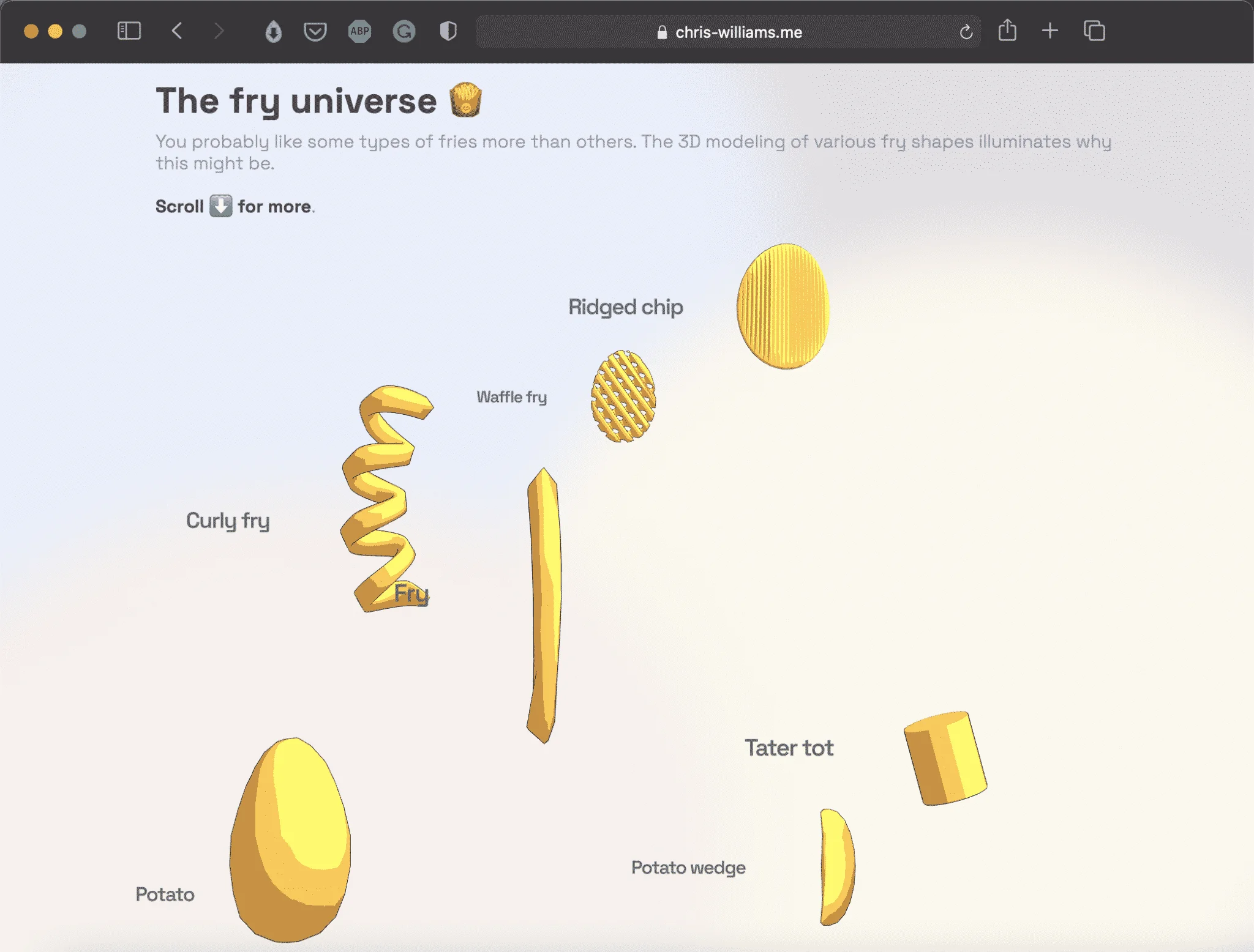
The Fry Universe is a short scrollytelling piece — interactive, 3D-modeled, unhurried — that walks through the major fry shapes and explains what the geometry is actually doing. The format is a single scrollable page where 3D models rotate and respond as you move, each shape introduced in sequence with its geometric properties shown directly.
The mechanics are straightforward once stated. A thin shoestring fry has an enormous surface area relative to its volume: almost the entire fry is close to the hot oil, which means almost the entire fry becomes crust. A steak fry is the opposite — a large interior protected by a thinner shell of crispiness, like a potato that has barely been persuaded to participate in the frying process.
“The question ‘what is your favorite fry?’ turns out to be a geometry question in disguise.”— The implication of the whole tool
A crinkle cut increases surface area beyond what a simple cylinder would have — which is why crinkle cuts are crunchier than their thickness suggests. A waffle fry is an engineering solution to the problem of wanting something simultaneously thick enough to hold its shape and complex enough to crisp in interesting ways. Curly fries, with their spiral geometry, have more surface area than a straight cut of the same diameter. That is the reason so many people prefer them, and have never once thought about why.
Six Shapes, One Ratio
The tool walks through six canonical fry shapes, presenting each as a 3D model and mapping its surface-to-volume ratio visually. The ordering is not random — it follows the ratio from highest to lowest, which maps almost perfectly onto most people’s intuitions about crispiness.
Approximate — based on 3D geometric modeling of fry cross-sections
On Scrollytelling as a Format
The fry shapes need to be seen in three dimensions to make sense — a waffle fry described in text is a different object from a waffle fry rotated slowly in front of you. This is a small thing to do well. Most web tools that deploy 3D modeling for a light subject produce something that feels either overwrought or half-finished. Williams’s piece is neither. It is proportionate — it uses exactly as much technology as the argument requires, and no more.
What makes the tool interesting beyond its immediate subject is the question it implies about taste preferences in general. Underneath memory and culture is a layer of pure physics: heat transfer rates, moisture gradients, the relationship between surface area and crust formation. Your preference for curly fries over steak fries is yours. It is also a straightforward consequence of how you are built and how oil and heat behave at a certain temperature.
The tool takes about five minutes to work through and leaves you with a framework you will find yourself applying at every fast food counter for the rest of your life. That is a modest ambition executed without waste — which is, oddly, exactly what a good french fry is.
Interactive Tool
The Fry Universe 🍟
3D scrollytelling visualization of fry shapes, surface-to-volume ratios, and the geometry of crispiness. By Chris Williams.
Open the Tool →