The logarithmic map is an old tool in the astronomy literature — useful but not particularly beautiful. In 2005, Princeton astronomers J. Richard Gott and Mario Jurić used data from the Sloan Digital Sky Survey to produce a logarithmic map of the 93-billion-light-year observable universe and published it in the Astrophysical Journal. The map was accurate, comprehensive, and thoroughly ugly. Budassi’s contribution was not technical but aesthetic — and that aesthetic caught more attention than the science.
According to Budassi, the whole thing started with a hexaflexagon. While folding these centrally symmetric paper polygons to make birthday favors for his son, something clicked: if you scaled the system up far enough, a circle expanding outward in concentric rings could hold the solar system, the galaxy, clusters of galaxies, and finally the remnants of the Big Bang in sequence. The next day he opened Photoshop. He layered NASA imagery with textures he made himself. Within a few days he had a disk spanning 93 billion light-years in diameter.
“When I was drawing hexaflexagons for my son’s birthday souvenirs, I started drawing central views of the cosmos and the solar system. That day the idea of a logarithmic view came.”
Pablo Carlos Budassi, Tech Insider interview
What Does a Logarithmic Scale Actually Mean?
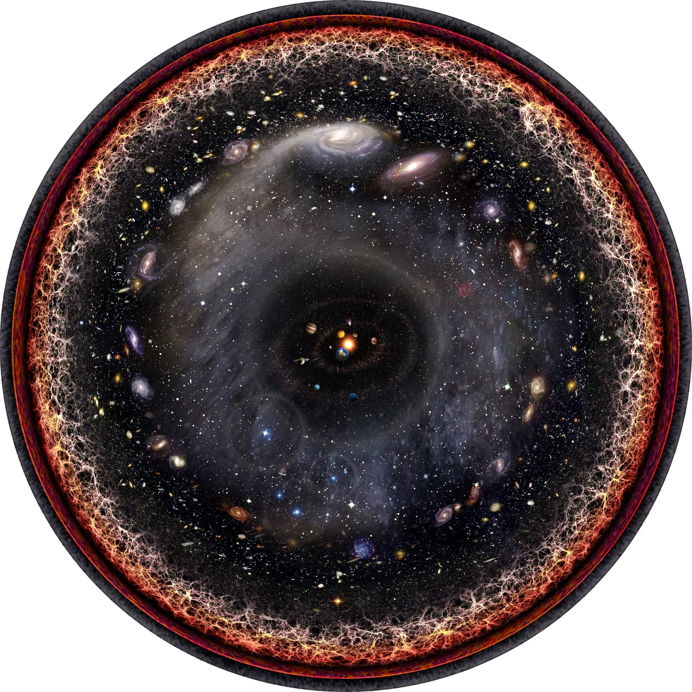
The observable universe spans 93 billion light-years across at its furthest boundary. The solar system is roughly 0.002 light-years in diameter — one ten-trillionth the size of the universe. Showing these two objects in the same image on a linear scale is physically impossible; the dot representing the solar system would be invisible at any resolution. A logarithmic scale solves this: each ring represents not ten times the previous distance, but several orders of magnitude further.
A note on logarithms
On a logarithmic scale, “moving 10 units forward” does not mean multiplying the distance by 10 — it means multiplying by a power of 10. In Budassi’s map, the distance from the solar system to the Oort Cloud is roughly 1 light-year; from the Oort Cloud to Alpha Centauri about 4 light-years; from there to the edge of the Milky Way, thousands of light-years. Each ring looks the same width in the image, but the real distance it represents grows exponentially.
From Center to Edge: The Map’s Layers
At the very center of the circle sits the Sun. Moving outward: the inner and outer planets, the Kuiper Belt, the Oort Cloud, the nearest star Alpha Centauri, the Perseus Arm of the Milky Way, the full Milky Way, the Andromeda galaxy, the Local Group, the large-scale cosmic web structure, and at the outermost ring the cosmic microwave background radiation — the light left over from 380,000 years after the Big Bang. The pink-red region visible in that final ring is the plasma behind the radiation: a layer that cannot be directly observed, known to exist only theoretically.
| Distance | Layer | Note |
|---|---|---|
| ~8 light-min | The Sun (center) | The map’s zero point |
| ~0.002 light-years | Solar system planets | Closest ring to center |
| ~1 light-year | Oort Cloud | Outer boundary of the Sun’s gravitational influence |
| ~4.2 light-years | Alpha Centauri | Nearest star system |
| ~100,000 light-years | Milky Way | Our galaxy in full |
| ~2.5 million light-years | Andromeda galaxy | The most distant object visible to the naked eye |
| ~46 billion light-years | Cosmic microwave background | Light from 380,000 years after the Big Bang |
| ~46+ billion light-years | Big Bang plasma | Beyond the visible universe; cannot be directly observed |
Princeton’s Ugly Map and Budassi’s Beautiful One
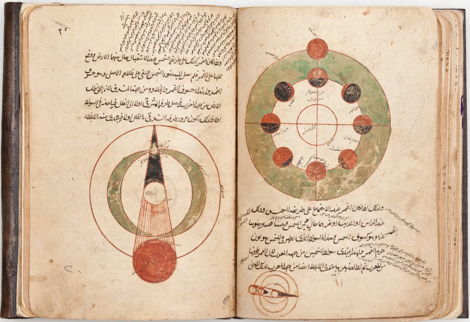
Gott and Jurić’s 2005 logarithmic maps were scientifically valuable for understanding the structure of the universe. Assembled from the Sloan Digital Sky Survey’s 2.5-meter wide-angle telescope in New Mexico and covering spectral data for more than 3 million celestial objects, the work remains a cited reference in the scientific literature. But it had no visual appeal. Budassi took those maps as his foundation, colored them with imagery from NASA’s rovers and telescopes, and uploaded the result to Wikimedia Commons in 2013. He claimed no copyright — he released it into the public domain. The tradition of making celestial knowledge visually legible is not new: al-Jaghmini’s 13th-century astronomy manuscript was doing something similar — rendering the structure of the heavens in a form that could be held, studied, and passed on — seven centuries before Budassi opened Photoshop.
The image reached a wide audience in a wave of internet coverage at the end of 2015 and the beginning of 2016. Space.com, ScienceAlert, Business Insider, and dozens of other outlets ran the same image as a news story. Budassi’s name became more associated with this circle than with his music career. Within a few years it had become one of the most downloaded science visuals on Wikimedia.
The Limits of an Image
Budassi’s map is beautiful but misleading — as every beautiful map is. The image presents the observable universe as a centrally symmetric disk, when in reality there is no directionality. The perception of a universe with the solar system “in the middle” is a reflection of pre-Copernican cosmology, and the map reinforces that impression. The logarithmic scale also shows only the order of distances, not their true relationships; the actual difference in distance between Andromeda and the Oort Cloud is far more dramatic than the pixel gap between those two rings.
None of this diminishes the map’s value. Dark matter accounts for 27 percent of the universe and dark energy for 68 percent — meaning 95 percent of the observable universe still cannot be directly measured. Budassi’s map conveys how the remaining 5 percent is structured — that is, what we actually have — in a form a child can grasp. Photography has attempted something similar for physics: Alejandro Guijarro spent three years photographing the blackboards at CERN, Cambridge, Stanford, and Oxford — capturing the raw working material of theoretical physics at human scale. An idea that came from folding paper for a birthday party has become one of the standard visuals in astronomy education. Not bad for something that started with cake and hexaflexagons.
Sources: Pablo Carlos Budassi, Observable Universe Logarithmic Illustration, Wikimedia Commons, 2013 (public domain). J. Richard Gott & Mario Jurić, “A Map of the Universe,” Astrophysical Journal, 2005. Kelly Dickerson, “This is what the entire universe looks like in one image,” Business Insider, January 2016. Bec Crew, “The Entire Known Universe, in a Single Image,” ScienceAlert, January 2018. Danny Clemens, “This Is the Entire Universe Squeezed into One Image,”Space.com, January 2016.