Blat-wijser of Register
Ten pigments, each laid down at full strength and then with one, two and three parts water, the way Boogert fills his pages.
der Verf-Konst 1
A color guide nobody reads
Pantone's color guides are probably the least read books in the world. Nobody reads them cover to cover. A printer, a designer or a house painter opens one to hold a sheet of paper, a piece of fabric or a can of wall paint next to a chip and compare, then closes it when the job is done. In 1692 someone in Delft who signs himself only as A. Boogert writes exactly this kind of book by hand and paints every page of it with his own brush, with no press to print it and no industry to open it and compare anything against it. Only one copy is known today, and nobody ever copied it.
The Dutch title is Klaer Lightende Spiegel der Verfkonst, roughly “The Clearly Illuminating Mirror of the Painter's Craft.” Later it enters the catalogue of a French library as Traité des couleurs servant à la peinture à l'eau, a treatise on the colors used in watercolor painting, and today it mostly goes by that French name. The page count moves between eight and nine hundred depending on the source, while the pages carrying swatches easily pass seven hundred. On the title page Boogert says what the book is in one long sentence: a book in which every kind of watercolor can be seen, with a description of how to prepare and mix them. Under the sentence sits a peacock butterfly with its wings open, and under that, Gedaen en beschreven door A. Boogert 1692, made and written by A. Boogert, 1692.
A butterfly on the cover of a color book is a very good choice to me, because a butterfly wing already looks like a color guide, and a single wing of the peacock butterfly puts brick red, soot black, straw yellow and ice blue side by side. The facing page holds the book's own picture. Two angels carry a panel decorated with laurel and the title is written on it, and below, while a painter works on a portrait at his easel, the women behind him prepare paint, one of them washing something in a basin of colored liquid.
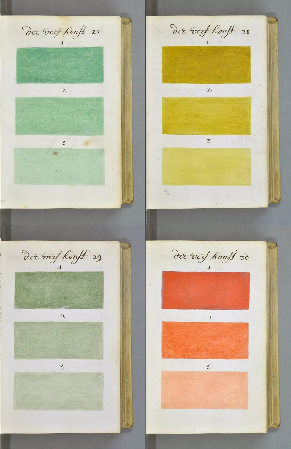
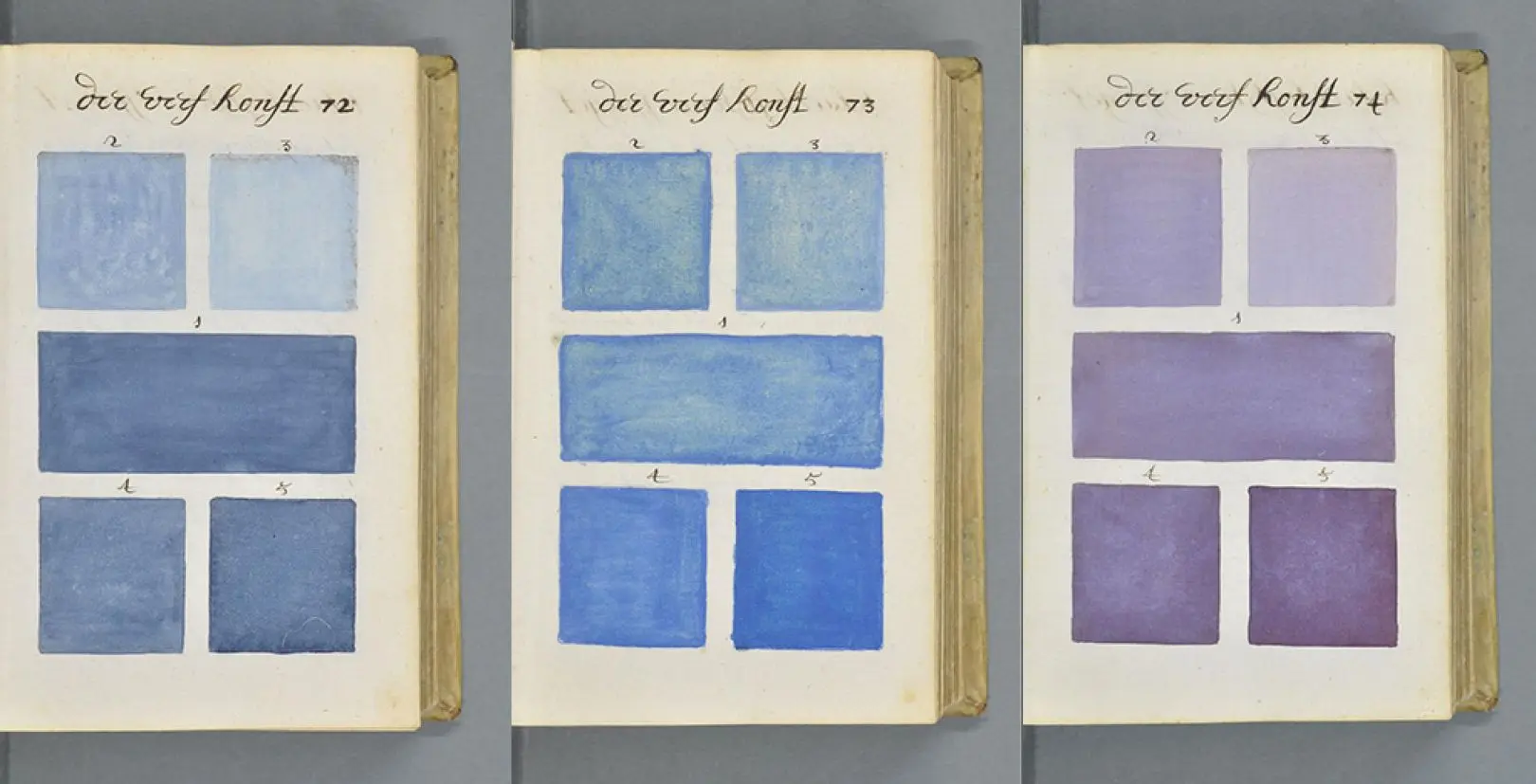
The body of the book is surprisingly orderly. At the top of every page there is the same heading, der Verf-Konst, a page number next to it and numbered swatches below. Some pages have three long bands stacked one under another, some a wide band in the middle with two small squares above it and two below. The first color page is lamp black, the soot collected from the flame of oil lamps and candles. On the facing page Boogert explains that this black is used a lot but has to be bound with gum water, then describes the three swatches one by one. The first is laid on as thick as it gets, the second a little more watery than the first, the third a little more watery than the second. The whole logic of the book sits in these three lines.
At the end of the book there is an index, which Boogert calls Blat-wijser of Register, page pointer or register. Each box in the index holds a page number and a color name, and on the facing page the color itself is painted as a small rectangle under the same numbers. The handwriting is not easy to read everywhere, but you can make out that page twenty-five is Spaens groen, the famous copper green made by leaving copper plates in vinegar fumes. Next to it there is crystallized copper green, sapgroen pressed from buckthorn berries, menie, which is red lead, and a red that reads as Florentine lake.
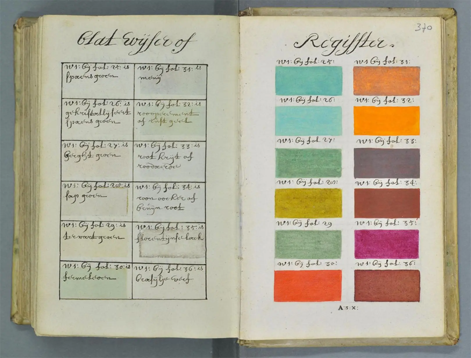
As a mathematician, when I look at this spread I see a lookup table more than an index. The address is in the left column, the value is in the right column, and this time the value is not a number but a color.
der Verf-Konst 2
Who was A. Boogert?
We do not know. We have an initial, a surname, a city and a date, and that is it. Who the book was written for we can guess a little better. The book historian Erik Kwakkel came across it in a French digital library in 2014 and translated part of its introduction. For him it is a teaching book, one that lets us look into the workshop of 17th-century painters and illustrators from a place we rarely get to see it. A teaching book surviving as a single copy is the strangest part of the whole thing, because we do not even know whether anyone ever learned from it.
In the Golden Age of Dutch painting a manual like this would have had plenty of buyers, but 1692 is a bit late. Rembrandt died in 1669, Vermeer in 1675, and most of the big names of that generation are gone when this book is written. Besides, those painters worked in oil, and Boogert has no interest in oil at all. The real users of watercolor were elsewhere. In the map workshops of Amsterdam there was a trade called the afzetter, people who colored printed maps and engravings one by one by hand, and the clean border colors in Blaeu's atlases came from their brushes. People who drew insects and flowers, painted miniature portraits and decorated books used the same paints, the same patient tradition that two centuries later would fill the USDA's pomological watercolors. To me Boogert's book would have looked best on their tables.
der Verf-Konst 3
Water, the only white
Boogert's system rests on a single idea: there is no white paint in watercolor. In oil, to lighten a color you mix lead white into it. In watercolor the white comes from the paper, and because the paint sits on the paper as a semi-transparent layer, the only way to lighten a color is to thin the layer, that is, to add water. Every page of the book shows how a single pigment is pulled toward the white of the paper as water is added, and this turns the book, whether he knew it or not, into a book of ratios.
Add one, two and three parts water to one part paint. The share of paint becomes 1/2, 1/3 and 1/4, so with n parts water the ratio is 1/(n+1). The steps of this sequence are not equal. From pure paint to the first mix the ratio halves, to the second it drops from 1/2 to 1/3, a difference of 1/6, and to the third the difference shrinks to 1/12.
Share of paint after n parts water = 1/(n+1)
The water rises in equal steps. The paint does not fall in equal steps.
How much light comes back from the paper to our eye is decided by this ratio too. Light passes through the paint layer, hits the paper, comes back and passes through the layer once more, and at every pass the pigment swallows part of it. By the rule chemists call the Beer–Lambert law, the light that gets through falls exponentially with concentration: when the concentration doubles, the share of light getting through does not halve, it drops to its own square. Suppose pure paint cuts the light coming back from the paper to one tenth. At half strength about 32 percent comes back, at a third about 46 percent, at a quarter about 56 percent.
Our eye does not measure light linearly, though. On the CIELAB scale used in color science, lightness grows roughly with the cube root of the amount of light and runs from zero to a hundred. On this scale the pure paint comes out at about 38, and the next three swatches at 63, 74 and 80.
+25
Lightness gained by the first part of water.
+11
By the second part. Less than half the work.
+6
By the third. Each part does about half of what the last one did.
So on Boogert's pages the second and third swatches should look closer to each other than the first and second. On some pages that really is the case, but on page thirty the orange suddenly turns into a light peach in the third swatch, which shows either that Boogert did not use the same measure on every page or that watercolor does not fit into a calculation this clean. The second is certainly true: gum arabic scatters light, some pigments settle into the fibers of the paper and granulate, and the thickness of the layer the brush leaves changes a little with every stroke.
If you wanted steps that look equal, instead of adding water in equal steps you would raise the lightness by equal amounts and work backwards to the concentration that gives it. The bench below does that. For each of six colors taken from Boogert's pages it paints four swatches with the same light model and lets you put three water sequences side by side.
paint 1
pure paint
lightness 68.3
paint 1/2
1 part water
lightness 81.3
paint 1/3
2 parts water
lightness 86.7
paint 1/4
3 parts water
lightness 89.6
In the Boogert sequence, lightness for Spaens groen rises first by 13.0, then by 5.4, and last by 3.0 units. Every new part of water does less work than the one before.
The “Boogert” and “even steps” sequences share the same first and last swatch, and only the two in the middle differ. For a ladder that looks even, the paint in the second swatch has to come down not to half but to around 70 percent for most colors, and to around 45 percent in the third. Boogert's measures take big steps on the dark side and small steps on the light side. That is not a mistake, because the fine adjustment a painter really needs is usually in the light tones anyway.
der Verf-Konst 4
Counting every color
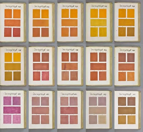
The book is often said to contain every color imaginable, and in a mathematician's head that claim immediately turns into a counting job. A color cannot be described with a single number. In 1905 Albert Munsell splits color into three axes: hue, value and chroma. Hue tells you whether a color is closer to red or to blue, value how light it is, chroma how saturated. Every page of Boogert's draws a single line through this three-dimensional space. The hue changes from page to page, and within a page the water pulls value and, with it, chroma toward the white of the paper. The book scans a three-dimensional space with hundreds of thin lines, each of them ending in the white of the paper.
If we assume three to five swatches on each of more than seven hundred pages, the book holds roughly between two thousand and three and a half thousand color samples. Today's Pantone Formula Guide holds a little over two thousand colors, so the book one man painted by hand in 1692 is about the size of today's industry guide. Estimates for the number of colors the human eye can tell apart wander between one million and ten million. Boogert and Pantone alike can show at best one five-hundredth of this space, and both leave the rest to guessing the gaps in between.
700+
Pages carrying painted swatches, out of eight to nine hundred.
~2,000–3,500
Color samples in the book, at three to five per page.
1–10 million
Colors the human eye is estimated to tell apart.
der Verf-Konst 5
From Aristotle's line to Pantone's numbers
Boogert's book has no known influence at all, and the reason is not only that it is a single copy. The book thinks about color within Aristotle's frame. Aristotle sees colors as things born from white and black coming together in different proportions, and Boogert's first color page being black, with every color opening toward white with water, fits this old frame exactly. Twelve years later, in 1704, Newton, whose Principia already sits among the books that changed mathematics, publishes Opticks and shows that white light is the sum of all colors and a prism only separates them. In the same book he arranges the colors on a circle that closes on itself, and the way of ordering color moves from a line running from white to black to a circle.
1692
A. Boogert paints the Klaer Lightende Spiegel der Verfkonst in Delft. One copy.
1704
Newton's Opticks splits white light with a prism and bends the line of colors into a circle.
1810
Goethe publishes his Theory of Colours.
1814
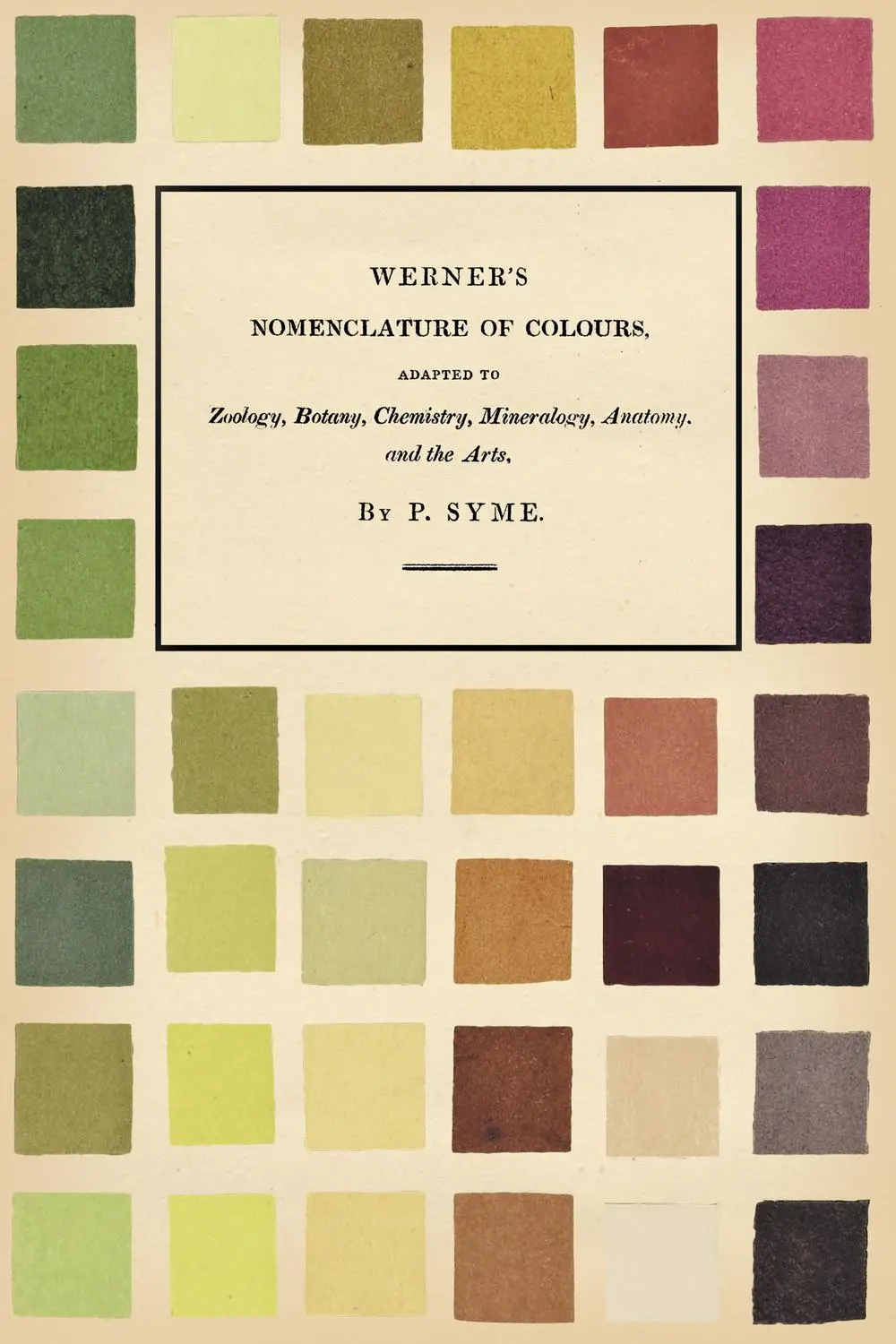
Patrick Syme prints Werner's Nomenclature of Colours: 110 colors, each tied to an animal, a plant and a mineral.
1905
Albert Munsell splits color into three axes: hue, value and chroma.
1963
Lawrence Herbert's Pantone Matching System gives every color a number.
The flood of books that make color useful for everyday work starts about a hundred years after that. Goethe publishes his Theory of Colours in 1810. In 1814 the Edinburgh flower painter Patrick Syme prints Werner's Nomenclature of Colours, expanding the mineralogist Abraham Gottlob Werner's color naming to 110 colors. Next to each color it says where that color is seen in an animal, a plant and a mineral, so a botanist or a birdwatcher can describe the vein of a leaf or the breast of a bird with words alone. Then comes Munsell in 1905, and in 1963 Lawrence Herbert's Pantone Matching System. The idea is simple. Every color gets a number, and wherever two printers are in the world, when they say the same number they mean the same ink.
In the Pantone guide, next to every number it says how many parts of which base inks you mix to get that color. In Boogert's index every color has a number too, and every page gives the recipe behind that number, only in parts of water instead of ink. The book sits today in the Bibliothèque Méjanes in Aix-en-Provence. High-resolution scans of all its pages are online in the library's digital collection, and anyone can turn through it page by page for free.
Sources
- A. Boogert, Klaer Lightende Spiegel der Verfkonst (1692), Bibliothèque Méjanes, Aix-en-Provence.
- Erik Kwakkel, on the Boogert manuscript and its introduction (2014).
- Albert H. Munsell, A Color Notation (1905).
- Isaac Newton, Opticks (1704).
- Patrick Syme, Werner's Nomenclature of Colours (1814).