Introducing a captivating game called Kern Type that lets you refine your kerning skills in an enjoyable setting. The objective of the game is straightforward: create text that is both attractive and easy to read by skillfully spacing the letters. This process, known as kerning, is an essential task for typographers, who fine-tune the spacing between letters to achieve an ideal visual balance. By playing Kern Type, you get hands-on experience adjusting the space between letters, honing your eye for detail, and learning how small changes can significantly impact the overall appearance of text. Dive into Kern Type and explore the art of creating beautifully spaced typography.
Game Mechanics
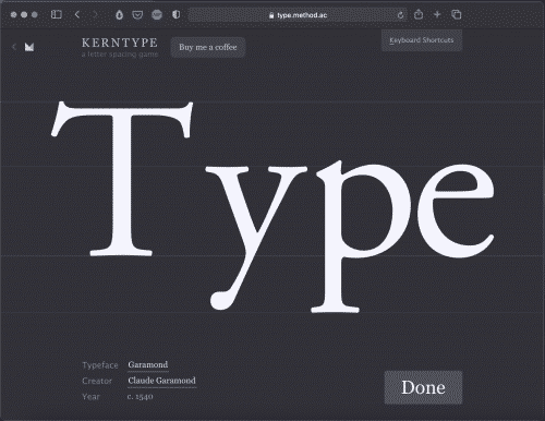
Kern Type is structured around a series of typographic challenges where players are tasked with adjusting the spacing between letters in various words. Each level presents a word with incorrectly kerned letters, and players must use their judgment to reposition the letters into an aesthetically pleasing format. Using a simple drag-and-drop interface, players slide the letters closer together or further apart, seeking to match their spacing to the optimal kerning standards. Once satisfied with their adjustments, the player submits the configuration to receive a score based on the accuracy of their kerning compared to the expert solution. The real-time feedback and score reveal how close you came to achieving professional-level kerning, making it both an educational and engaging experience.
Understanding Kerning in Typography
Kerning in typography refers to the adjustment of space between individual letter pairs to achieve visually pleasing and readable text. Unlike tracking, which uniformly spaces characters across an entire word or paragraph, kerning focuses on fine-tuning the spacing between specific pairs of letters, taking into account their shapes and combinations. Proper kerning eliminates awkward gaps and overcrowding, which can detract from the readability and aesthetic quality of the text. Skilled typographers meticulously kern letter pairs to balance and harmonize the text’s overall appearance, ensuring that it draws the reader’s attention seamlessly across lines and paragraphs. Effective kerning can greatly enhance the legibility and professional look of printed and digital media, making it a critical skill in the design world.
Importance of Kerning Skills
Mastering kerning skills is essential for anyone involved in the design and presentation of text, as they have a profound impact on the visual and functional quality of typography. Proper kerning enhances the readability of text by ensuring that letters within a word are spaced harmoniously, allowing readers to effortlessly discern words and sentences without distractions caused by uneven spacing.
In the world of branding and marketing, where first impressions are crucial, well-kerned text can convey professionalism and attention to detail, ultimately elevating the perception of a brand. Furthermore, kerning contributes to the aesthetic appeal of design, making textual content look polished and expertly crafted. For typographers, graphic designers, and anyone involved in visual communication, refining kerning skills is a fundamental step towards producing compelling and effective work that stands out and communicates messages clearly.


