In today’s digital age, data visualization is all around us – from graphs and charts in newspapers to interactive dashboards on our smartphones. It’s hard to imagine a time when the scientific community scoffed at these captivating visuals. But over 200 years ago, William Playfair pioneered using shapes to represent numerical data, challenging the conventional wisdom of his time.

Despite being met with skepticism, Playfair’s innovative approach paved the way for a revolutionary new way of visualizing data. Today, data visualization has evolved into an art form, with designers and analysts using the latest tools and technologies to create stunning, meaningful displays.
Indeed, it’s hard to overstate how data visualization has transformed the way we think about and communicate complex information.
According to the Royal Society, here are five charts that have changed the world in their own way.
Dr. John Snow’s Dot Maps
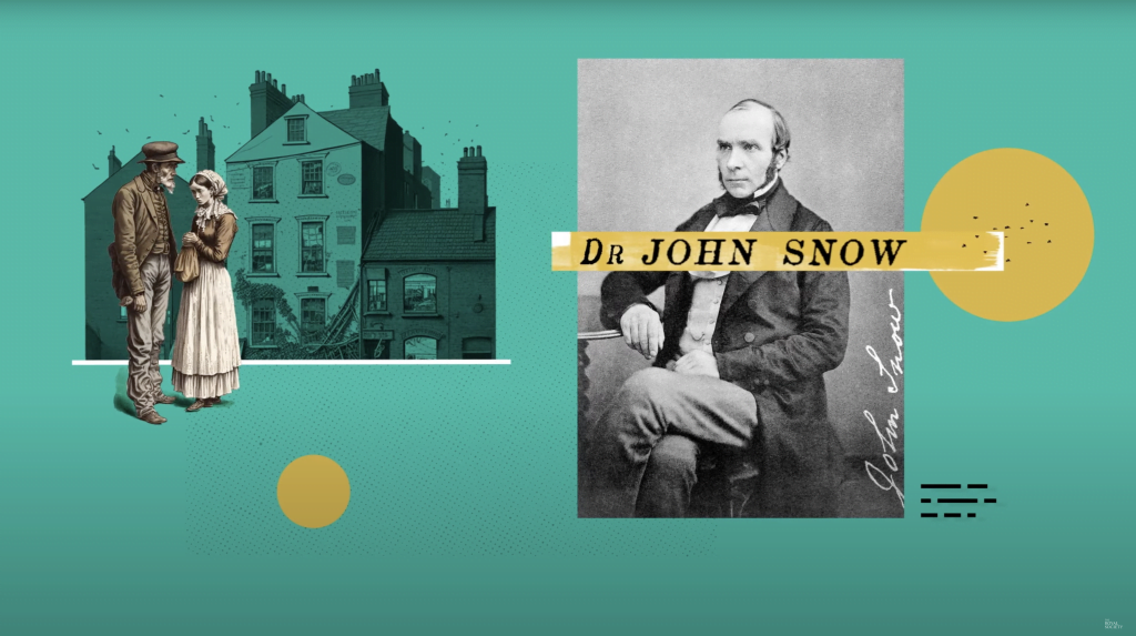
In 1854, surgeon John Snow revolutionized the medical world with his innovative data visualization. At the time, many believed that airborne disease was the culprit behind infectious epidemics like cholera.
However, Snow disagreed – he believed that dirty water was the real culprit behind the deadly outbreak that was occurring in Soho. To prove his theory, Snow mapped out each cholera case with a dot, and when he presented his findings to local officials, the reality became clear.
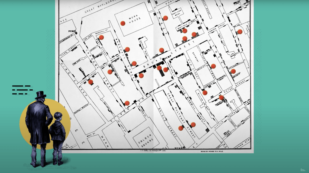
Every case was isolated around a single water pump on Broad Street, and when the pump was shut down, the outbreak ended. Thanks to John Snow’s pioneering use of data visualization, we now understand the critical importance of clean water sources in preventing the spread of microbes.
As you can see, statistics is an extremely important subject! And I believe statistics needs to be taught earlier in the curriculum! If you need some nice book recommendations about statistics, you should visit Statistics 101: The Best Statistics Books to Help You Master the Subject.Florence Nightingale’s Coxcomb
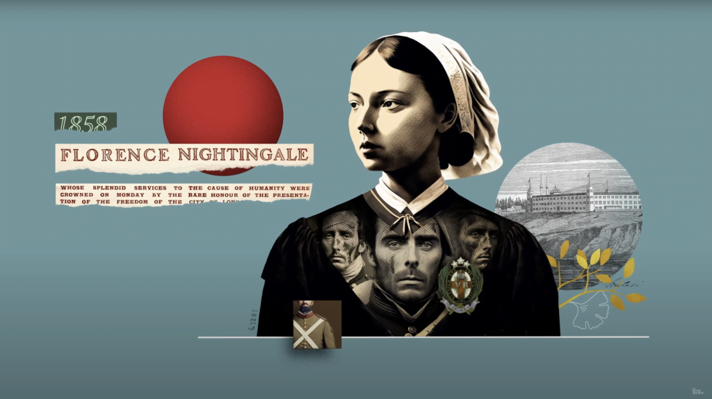
During the Crimean War, the Lady with the Lamp, Florence Nightingale, made a groundbreaking discovery that would revolutionize modern healthcare. She found that soldiers were dying in hospitals due to unsanitary conditions rather than injuries sustained in battle.
In an effort to persuade Queen Victoria to fund better conditions in military hospitals, she created the Coxcomb, a visual representation of the data on soldier deaths. Through her efforts, military hospitals vastly improved their sanitary conditions, eventually overhauling modern healthcare.
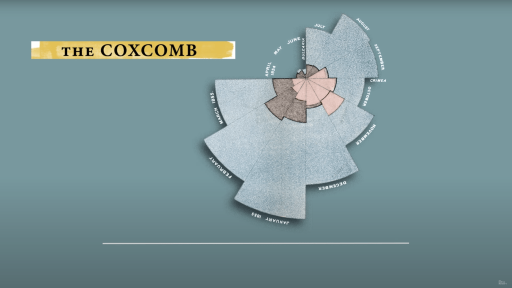
Florence Nightingale’s legacy continues today, and her work is a powerful example of how one person’s determination can create lasting change.
W.E.B. Du Bois’ Visualising Black America
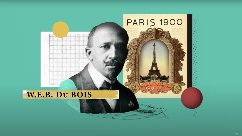
In 1900, at the Paris World’s Fair, American historian and civil rights activist W.E.B Du Bois created a stunning series of handmade charts showcasing black Americans’ accomplishments in the 35 years since slavery had officially been abolished.
These charts challenged stereotypes and showcased how black communities were still facing discrimination. Du Bois, who believed that the color line was the problem of the 20th century, hoped that his visualizations would help end racial prejudice worldwide.
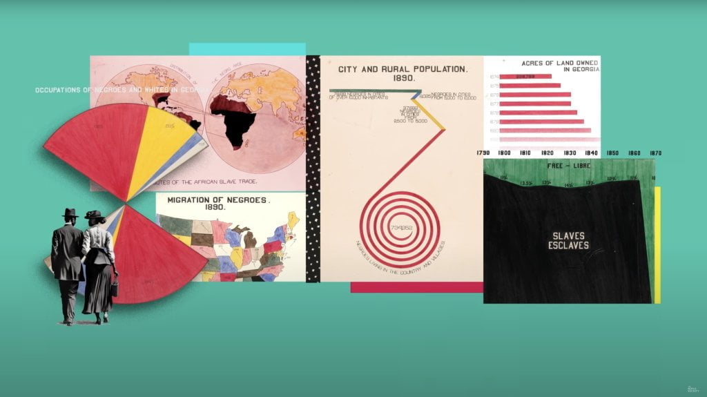
While his dreams were not immediately realized, Du Bois’s beautiful charts are now recognized as an effective use of data visualization to demonstrate social change. Through his original work, Du Bois has left behind a unique legacy inspiring generations to come.
Henry Goddard’s The Kallikak Family’s Tree
Data visualization has become a powerful tool in today’s digital age, allowing us to visually represent complex information in a way that is easily digestible. However, it is important to note that data visualization can also be utilized to spread misinformation with detrimental consequences.
Henry Goddard, an American psychologist and eugenicist, wrote a book claiming that feeble-mindedness was hereditary and presented the story of a fictional character Martin Kallikak as evidence. According to the book, Kallikak had a feeble-minded son from a barmaid, and then his son had ten feeble-minded children.
Henry Goddard used the story in the book and made a family tree of Kallikak’s family.
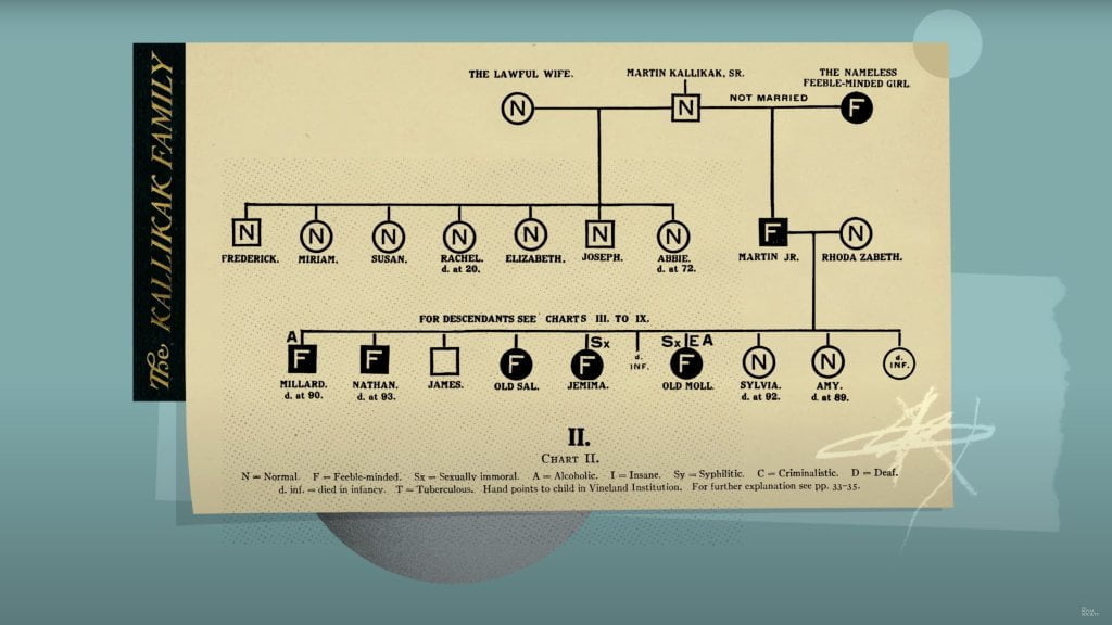
However, Goddard’s story was complete fiction based on a non-existent barmaid. Unfortunately, this misinformation was adopted by the Nazis and used to justify their horrific actions in the Holocaust, including the murder of thousands of disabled people.
This cautionary tale reminds us of the powerful consequences that data visualization can have when it is used to spread misinformation.
Ed Hawkins’ Warming Stripes

Climate change is a topic that scientists have been warning us about for years. But how can we help nonscientists understand the severity of the problem?
Ed Hawkins, a scientist, found a solution with his innovative chart known as the warming stripes. His goal was to convey the increase in global temperatures in a way that even those without a scientific background could understand.
The updated yearly chart is made up of stripes of different colors, with blue indicating cooler-than-average years and red showing years with temperatures hotter than average.
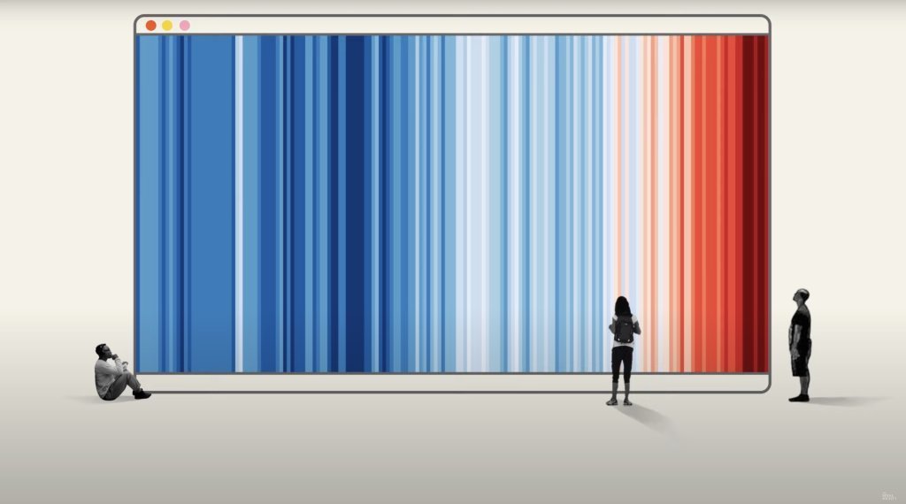
This year, every country needed a new red stripe for the first time, showing how fast our climate is changing. Despite breaking some of the rules of data visualization, the warming stripes are a powerful tool in helping people understand the gravity of climate change.
What do you think the next chart to change the world will be?
Before you leave, here are some nice book recommendations about data visualizations.
