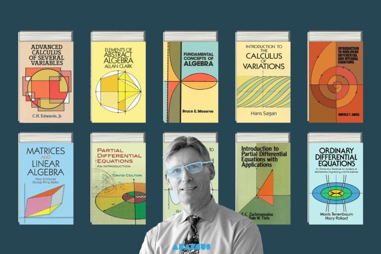
When you hear the phrase “math tools,” your mind might jump to a ruler or a calculator — but the ones we’re about to dive into are way beyond “what’s two plus two” level. These are the kinds of tools that make math more intuitive, more visual, and honestly… more fun to mess around with. Some hide quietly in the pages of a book, while others leap out of your browser yelling, “Think about the graph like this, come on!”
In this post, I am going on a tour that stretches from 3D paper models to digital calculus sidekicks, from global maps of mathematics to tools that spark real-time classroom interaction. Because sometimes, a formula just isn’t enough — it needs to move, to morph, to show you something. So let’s take a look at these tools that might just make even the math skeptics raise an eyebrow and say, “Wait… that’s actually kind of cool.”
Table of Contents
Seeing Theory
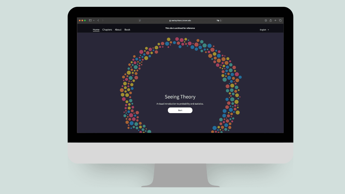
When people hear the word “statistics,” some immediately picture a wasteland of grayscale PowerPoint slides, terrifying formulas, and endless spreadsheets. But Seeing Theory drops a colorful, interactive oasis right in the middle of that desert. And no — it’s not a mirage. It actually works.
Made by Daniel Kunin, a math and computer science student at Brown University, this project brings 18 core statistical concepts to life through interactive visualizations. From probability and random variables to regression and the central limit theorem, it’s all here — but forget the “read and pray” approach. This time, you get to drag sliders, click buttons, and see how the math behaves. Adjust a variable and watch the graph shift in real time. Suddenly, stats isn’t just something you calculate — it’s something you see.
Best part? It’s not just for students. Whether you’re a data analyst, a curious learner, or someone who once ran from stats and now has to make peace with it — Seeing Theory is the perfect re-entry point. It doesn’t rewrite statistics. It just presents it the way it was always meant to be: visual, intuitive, and surprisingly fun.
Calculus Made Easy
Silvanus P. Thompson’s Calculus Made Easy, written in 1910, is still the go-to book for anyone who believes “calculus doesn’t have to be scary.” Concepts like derivatives, integrals, and limits are explained with such clarity, warmth, and honesty that even someone seeing them for the first time will say, “Okay, this actually makes sense.”
What’s beautiful about the book is how it dives right into the concepts and explains abstract ideas visually. Forget the usual “long definitions first, examples later” structure — here, everything is geared toward intuition. Instead of drowning the reader in technical jargon, it focuses on geometric and conceptual clarity. Toward the end, the book also touches on real-life applications like compound interest and the laws of growth and decay — proving that calculus isn’t just about numbers.
Recently, this classic was digitized by a group of volunteer mathematicians who did an exceptional job preserving and modernizing it. They’ve made it more accessible for today’s learners, complete with step-by-step solutions to the exercises. So now, over a century later, this friendly and approachable calculus guide still lives on — not in dusty libraries, but on vibrant screens.
Brilliant
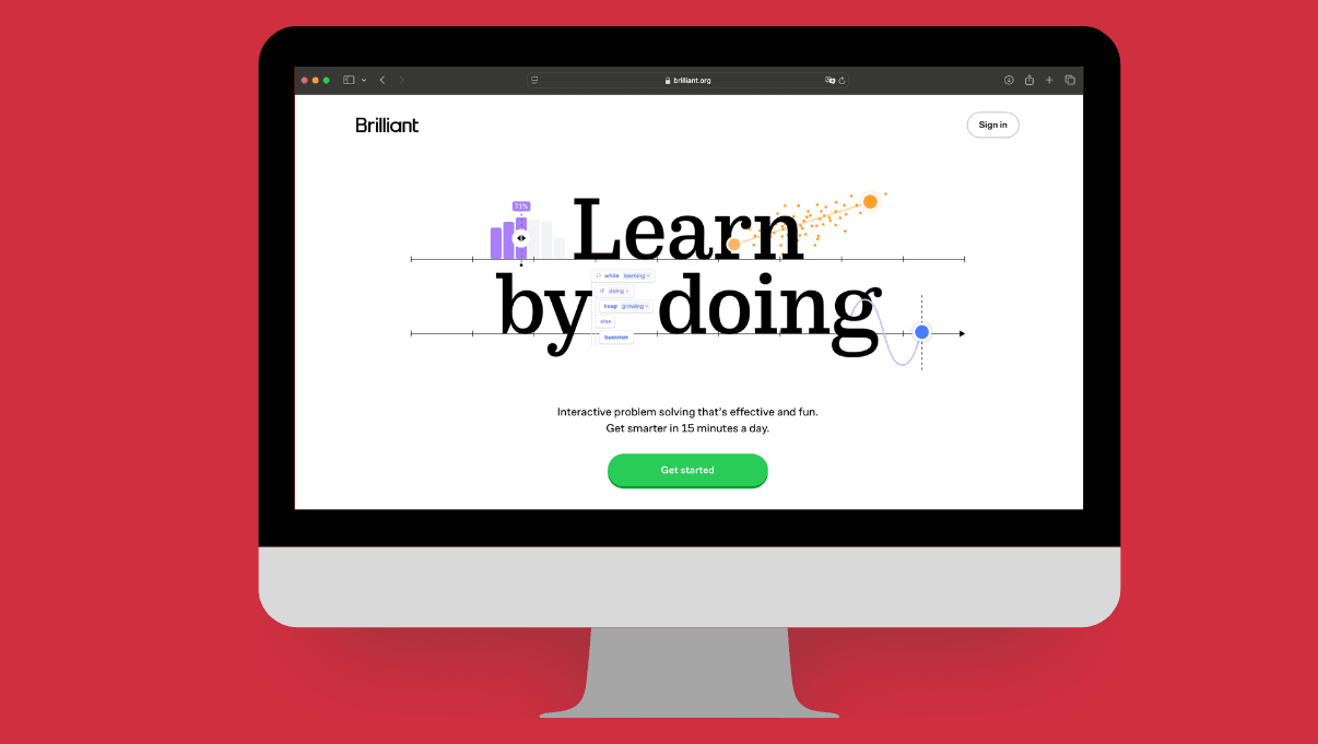
Some platforms teach you lessons, some get you ready for exams — but Brilliant? It tosses little sparks of logic straight into your brain. If you enjoy playing with numbers, shapes, probabilities, and code, this place is absolutely for you. And it doesn’t just explain things — it nudges you with a playful “here, figure this out yourself.”
You’ll find everything from algebra and calculus to quantum physics and computer science. But what really sets Brilliant apart is how it makes you think. There’s no “watch this and move on” here — instead, you interact with each concept, solving puzzles that force you to understand the why, not just the what. Their whole philosophy is “Think. Do. Learn.” And weirdly enough… it works.
Whether you’re a student, a grown-up dealing with math at work, or just someone who likes feeding their brain during coffee breaks — Brilliant might just replace your nightly “What should I watch?” with “What should I learn?” It works in the browser, it works as an app, and it works pretty much anywhere your brain is online and curious.
Mathigon
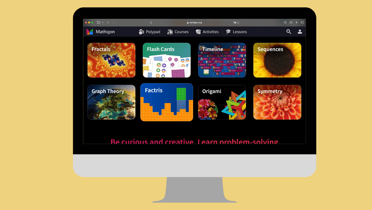
If there’s such a thing as “the textbook of the future,” Mathigon is it. But don’t let the word “textbook” fool you — this isn’t a PDF you scroll through. It’s an interactive, hands-on experience that basically looks at you and says, “Your turn.”
Mathigon takes classic math topics and strips away the boring. What’s left is something between a discovery, a puzzle, and maybe a little bit of magic. You don’t just read — you answer questions, drag shapes, explore patterns, and build your understanding through interaction. It’s not passive learning. It’s more like playing math rather than studying it.
And the best part? It’s completely free. Whether you’re on a phone, tablet, or computer, it adapts to your screen and delivers a surprisingly personal experience. It works for students with gaps, for curious learners who want to go beyond the basics, and even for teachers who need a refresher. Mathigon doesn’t just explain math — it invites you to explore it. And sometimes, the best way to learn is to play a little.
Desmos
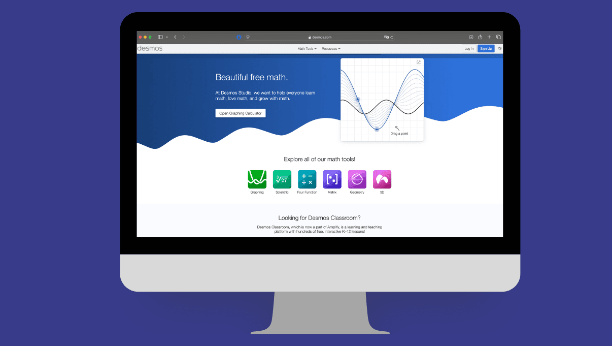
If you’re a teacher or a student who’s ever said, “Graphing is a pain,” Desmos is probably already your friend. But Desmos takes it a step further. It’s not just about drawing graphs anymore — it’s about turning that process into a guided, collaborative, and interactive learning journey.
The magic lies in how it structures complex problems. Instead of throwing formulas at students, Desmos leads them through multi-step questions, gathering detailed feedback along the way. Teachers can see not just what students answered, but how they think — what they misunderstood, where they got stuck, and which ideas clicked.
Desmos also shines in collaborative settings. Students explain concepts to each other in real time, often in clearer ways than any textbook could manage. Plus, you can use it in so many contexts: from group problem-solving to spiraling through increasingly complex variations of a single concept. It’s free, it respects privacy and accessibility standards, and it integrates LaTeX beautifully for clean, authentic math notation. Honestly, if your school is still paying for some clunky tool that doesn’t support proper math interaction, it might be time to switch.
GeoGebra
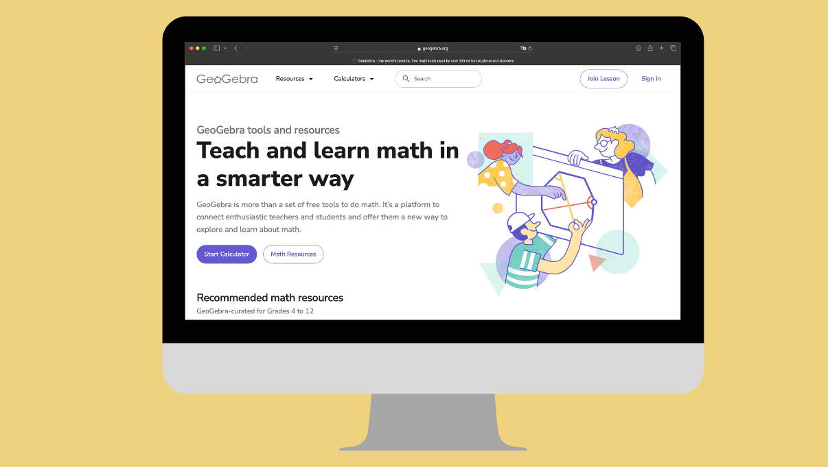
GeoGebra is one of those rare tools that doesn’t just explain math — it shows it. With this platform, you can type in a function and instantly see its graph. Want to show how the vertex of a parabola changes? Just drag a slider and let the equation come to life. Instead of forcing students to memorize “y = ax² + bx + c,” you can say, “Watch what happens when we tweak a.”
It’s pure gold for teachers. You don’t have to draw every graph by hand on the board anymore — a few clicks, and students are seeing how math works in real time. From algebra to calculus, geometry to probability, GeoGebra makes abstract concepts visible. And since it’s free and runs right in your browser, it’s incredibly accessible for any classroom.
But really, GeoGebra is more than a tool — it’s a playground. You can experiment, make mistakes, try again. That alone makes math feel a lot less intimidating and a lot more fun. If you’re trying to make math more hands-on, more visual, more “click-and-see,” GeoGebra is absolutely worth exploring.
The Mandelbrot Set
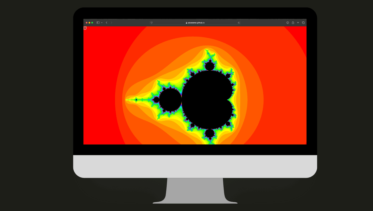
Math and art don’t usually sit at the same table — but the Mandelbrot Set pulls up a chair, leans in, and says, “Let me show you something.” What follows is a hypnotic swirl of patterns that zoom, twist, and spiral deeper the closer you look — like math decided to throw a rave and forgot to tell the rest of us.
This king of fractals isn’t just visually stunning; it’s conceptually wild. Out of complex number calculations repeated over and over emerges something that feels… poetic. And the best part? Thanks to a slick online tool developed by Ákos Seres, you don’t need a math degree or an art portfolio to dive in. Just click, zoom, and get lost.
If you haven’t wandered into the Mandelbrot universe yet, consider this your invitation. It’s mesmerizing. It’s mind-expanding. And yes — it’s infinitely more fun than doing your taxes.
Paper Plotter
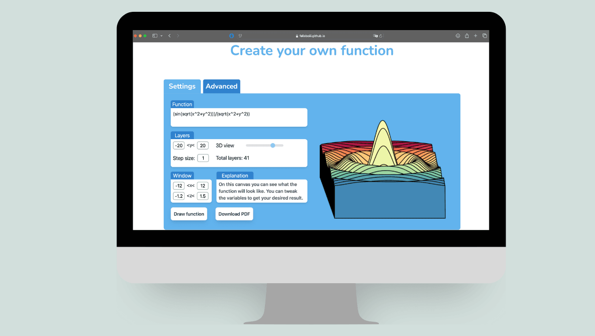
3D graphs made of paper? Yep, it’s a thing — and it’s awesome. Paper Plotter is an online tool that lets you create printable 3D models of mathematical functions. It was developed by a 16-year-old named Felix during the COVID lockdown as a personal side project — and it’s surprisingly powerful.
You can define your own functions — like (sin(sqrt(x^2+y^2)))/(sqrt(x^2+y^2)) — adjust the viewing window, set step sizes and layers, and then export a PDF of the plot. The PDF can be printed, cut out, and assembled layer by layer to produce a real, physical model of your function.
Instructions are simple: print it on thick paper, cut the layers, slot them together on two strips, and boom — your abstract math function is now a tangible object. There are also sample functions ready to download if you just want to try it out. And if you come up with something cool or notice a bug, Felix actually invites you to send him an email. The whole thing is open, creative, and fun — like origami for math lovers.
Pop Math
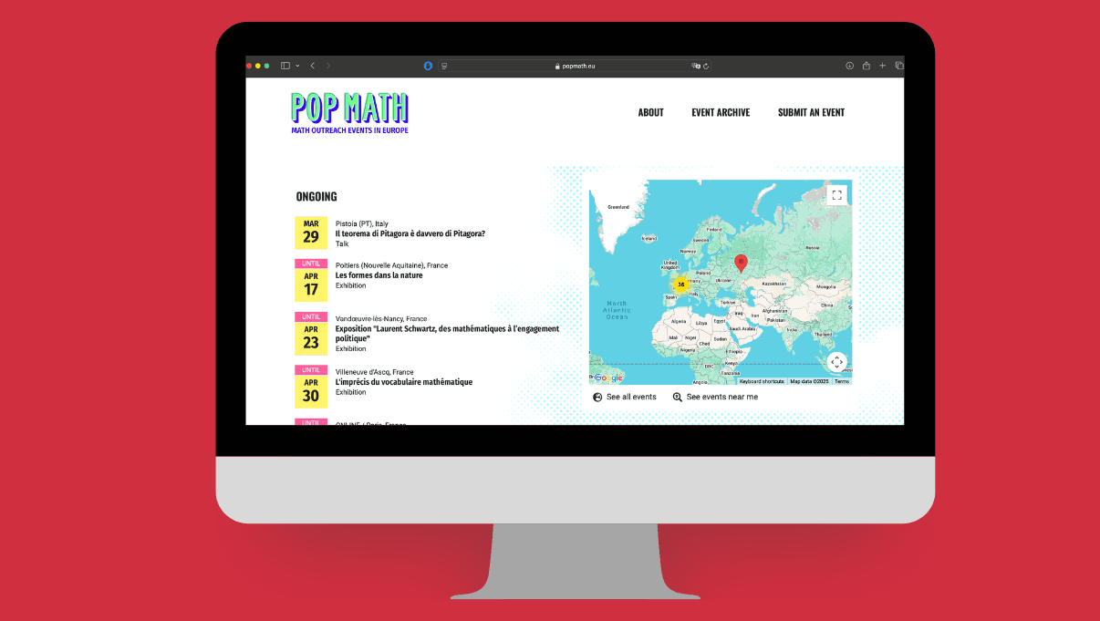
Getting people to love math isn’t easy, but Pop Math is trying. Backed by the European Mathematical Society, this online platform serves as a global map and calendar of math outreach events — from local talks to huge international math festivals. Launched in January 2021, its goal is simple: to help people find and share math communication efforts more easily.
What makes Pop Math stand out is its openness. Anyone can add events without even making an account. You can browse what’s happening in your city or across the world — whether it’s a public lecture on math and climate, a Zoom session on AI and probability, or a touring exhibition in your language.
The pandemic forced Pop Math to adapt — and it did. Now it supports online and hybrid events, and it even archives past events for reference. Looking ahead, the team wants to build embeddable widgets, create the first directory of active math communicators, and help universities improve how they engage broader audiences. If you care about math outreach — or just want to see what’s happening globally — Pop Math is the place to go.
The Map of Mathematics – Quanta Magazine
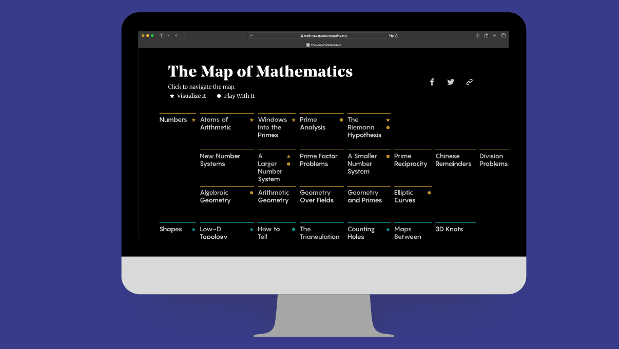
If you’ve ever wanted to see the big picture of mathematics, The Map of Mathematics by Quanta Magazine delivers just that. Made by writer Kevin Hartnett and designers Kim Albrecht and Jonas Parnow, this project offers a conceptual map of how math is practiced today — starting with simple ideas like numbers and shapes, and branching into everything from topology to symmetry to chaos theory.
You can follow a linear path or hop around freely — there’s no wrong way to explore. What matters is that you get a feel for how the many subfields of math are connected. For instance, you’ll see how prime numbers relate to geometry, or how symmetry leads to questions about infinity.
Of course, no map can capture all of mathematics — it’s just too vast. But this one gives you just enough structure to start digging deeper. As Einstein said, math is “the poetry of logical ideas,” and this project captures that spirit in a beautifully designed, intellectually curious way. It’s not a calculator — it’s a compass.
Snowflake Generator

Some tools teach math, some show it… and then there are a few that just take your hand and say, “Let’s be amazed for a moment.” Vivian Wu’s Snowflake Generator falls squarely into that third category. It takes the fractal nature of snowflakes, sprinkles in a touch of visual meditation, and gives you one of the simplest yet most elegant forms of data art.
You can tweak parameters like growth, symmetry, and density — and with every slider you move, the generator gifts you a completely new snowflake. They’re intricate enough that you can easily lose track of time just staring at them. Let the animation loop in the background, and suddenly you’re breathing deeper without even realizing. Breathe in. Breathe out.
This tool isn’t here to drill formulas into your head — it’s here to celebrate the aesthetic side of math. Snowflakes born of code are a gentle reminder that maybe nature itself is written in parameters. No equations, no tests — just that quiet little “whoa” in your brain. And honestly, sometimes that’s the best kind of math tool.
Complex Analysis: A Visual and Interactive Introduction
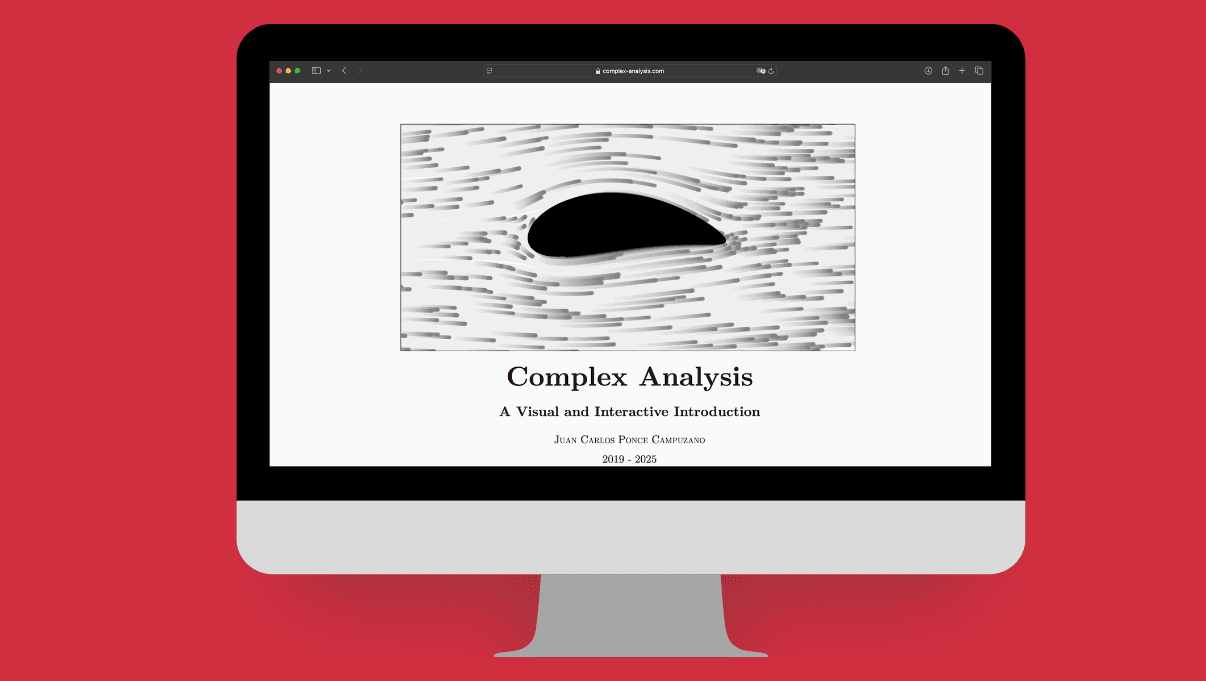
Complex numbers are already a fascinating world on their own — but Juan Carlos Ponce Campuzano’s interactive online book doesn’t just open the door to that world, it invites you in and says, “Here’s your lab. Go play.”
Unlike traditional resources, this book doesn’t just tell you about concepts — it shows them. Domain coloring, conformal mappings, Cauchy theorems… they all come alive through visual, interactive applets. Built with open-source tools like GeoGebra, p5.js, and Cindy.js, the book turns equations into landscapes. Ever wondered what a complex function looks like? Here, you just click and see.
It doesn’t try to cover every single topic from a textbook — and that’s kind of the point. This isn’t about completeness, it’s about curiosity. It’s a gateway, a visual “hey, look how beautiful this stuff is.” If complex analysis has ever felt cold or intimidating, this site might just flip that perception entirely. Whether you’re a student or a curious wanderer, it’s a resource well worth exploring.
Wolfram Alpha
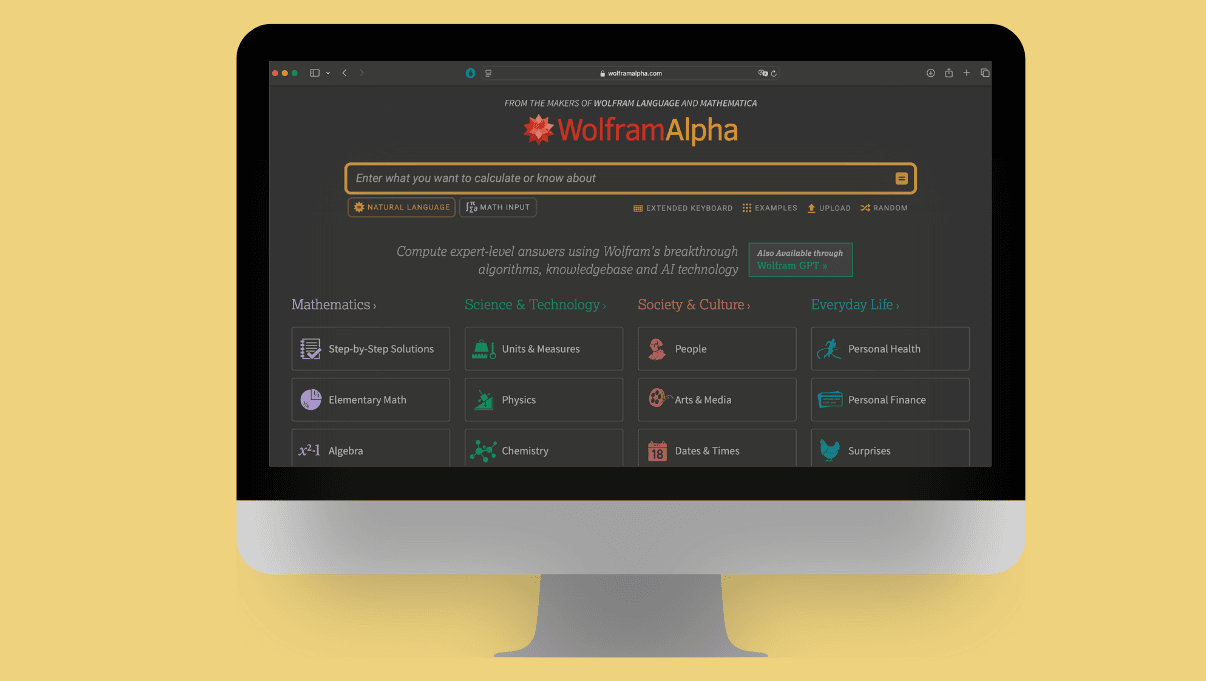
Want to solve an integral? Find a limit? Plot a system of equations? Wolfram Alpha AI is what happens when a search engine grows up and goes to math grad school. Built by Wolfram Research, it’s a computational knowledge engine — meaning it doesn’t return links, it returns answers.
It’s especially useful for math. You can type in a problem using natural language — like “solve x² + 3x + 2 = 0” — and Wolfram Alpha will not only solve it, but walk you through every step. It’s incredibly accurate, and the step-by-step breakdowns make it a fantastic learning companion. You can use it for algebra, calculus, statistics, and more.
But it doesn’t stop at math. Wolfram Alpha also handles science, engineering, finance, and even unit conversions with ease. Its clean interface and multi-platform access (web, mobile, notebook) make it ideal for students, teachers, researchers, and STEM professionals. It even offers API integrations for developers and a Pro version with extended features.
Yes, the Pro plan costs money — and yes, it’s a bit intimidating for total beginners. But for anyone serious about solving hard problems and understanding the why behind the answers, Wolfram Alpha is in a league of its own. Compared to tools like ChatGPT (great at language) or Perplexity AI (good at summaries), Wolfram Alpha is the go-to for precise, structured computation.


